Web Design
Sverhus.com
Construction, presented properly.
Web & product · Web Design · 2022
7 min read
- Year
- 2022
- Role
- Graphic & Multimedia Designer (Web Design)
- Context
- A representative website for an international construction company, designed to turn complex services and project proof into trust.
- Outcome
- Delivered as a responsive seven-template site with clear services, reusable project stories and a dedicated careers path.
At a glance
Overview
Sverhus (Sver | hus) is a construction company serving commercial and residential projects – demolition, drywall, tiling, flooring, carpentry, masonry and full design-build delivery – with completed work in the US, Sweden, Denmark and Norway, delivered by a team of around 34 people across 8 construction teams.
The project was a representative website that makes a mid-size construction firm look as solid as the buildings it delivers. No shop, no booking flow – this is trust design. Every page exists to answer three questions a potential client silently asks: are you good, can you handle something like mine, and how do I reach a human? The deliverable was a complete responsive design system across seven templates.
Role
Graphic & Multimedia Designer (Web Design)
Client
Sverhus.com – real estate construction builders for commercial and residential projects. 25 – 50 employees.
Scope
Representative website – Mainpage, About, Services, Projects, Single Project, Career and Contacts – responsive for desktop and mobile, built on a 12-column grid.
The challenge
Construction is one of the most template-saturated industries on the web. The typical builder site is a wall of jargon paragraphs, stock photos of helmets and a phone number buried in the footer – and Sverhus’s own content inherited some of that industry DNA, with seven paragraph-heavy service lines to tame.
The core design problems
- Making dense content scannable. The company communicates in long, earnest paragraphs – passion for quality, design-build advantages, process descriptions. The web experience had to translate that wall of words into something a busy retail-chain project manager or a homeowner actually scrolls through.
- Proving capability without a portfolio wall. 38 finished projects is a real number, but construction projects photograph unevenly. The design needed a single-project template that makes any job look considered, and an index that invites clicking rather than overwhelming.
- Two audiences, one site. Commercial clients evaluate capability, process and reliability; residential clients evaluate craftsmanship, empathy and trust. The same site had to speak credibly to a franchise owner and to a family renovating a kitchen.
- Recruitment is part of the job. A 25 – 50 person company in a tight construction labour market needs the site to work as a hiring channel too – hence a dedicated Career template, which most small-builder sites skip entirely.
- A brand, not just a business page. The split “Sver | hus” wordmark is the one asset with real personality. The web experience had to be built around that identity: precision, structure, quality.
Project goals
- A representative site that reads as professional and trustworthy at first glance – construction is bought on trust, and the site is the first handshake.
- Structure seven paragraph-heavy service lines into a scannable, navigable experience – information design was the core UX task.
- A project showcase that scales: an index and single-project template pair that grows with every finished job.
- A career page that competes for talent, not just a page that sells.
- Full responsiveness on desktop and mobile – commercial clients browse at a desk, residential clients browse from their sofa.
- Brand consistency from wordmark to footer, carrying the “passion for quality” positioning everywhere.
Information architecture
Seven templates, mapped to the decision journey of a construction client: orient, believe, verify, then act.
1. Mainpage
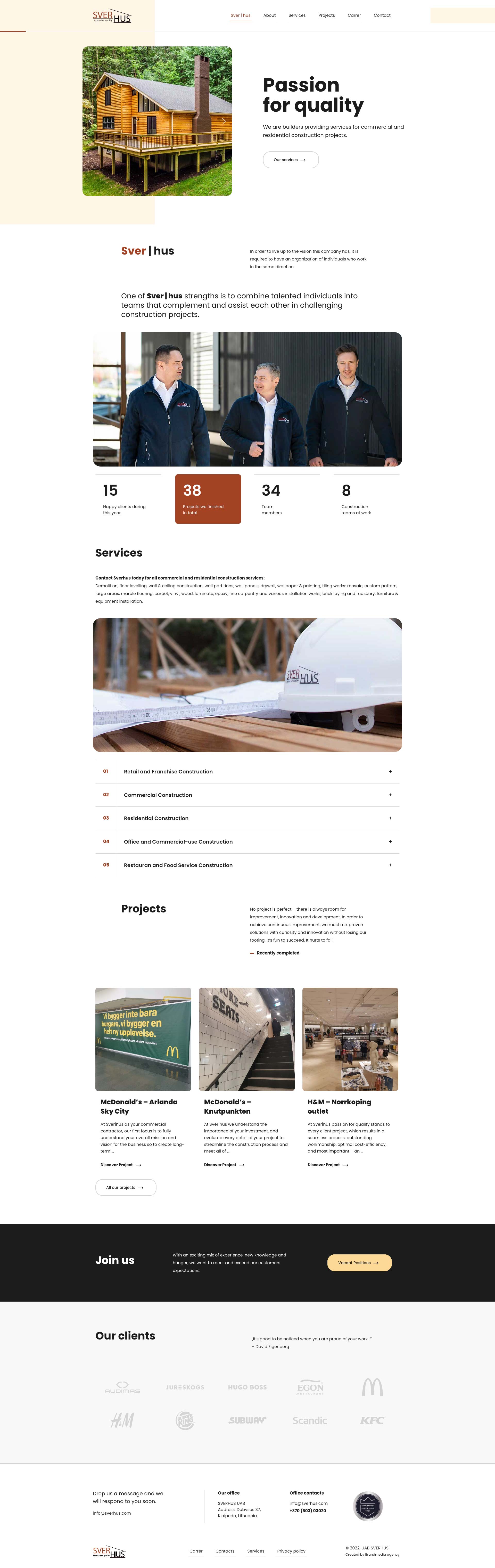
The pitch in one scroll: brand statement, who they are, a distilled services overview, proof statistics – happy clients, projects finished, team members, teams at work – and a clear contact call-to-action. Its job is orientation and proof.
2. About
The people and the values. For a services company the organisation is the product; this page sells the team and the “talented individuals in complementary teams” story.
3. Services
The deep-dive. The umbrella page structures the service lines – retail and franchise, commercial, residential, office, restaurant and food service – so each audience can find and enter its own track instead of wading through all of them.
4. Projects
The proof index: a scannable grid of completed work – the bridge from “they say” to “they did”.
5. Single Project
The case-by-case evidence. One project presented with enough structure – scope, type, outcome – that any completed job becomes a credibility asset.
6. Career
The recruitment channel. Trust flows both directions on a builder’s site: this page speaks to tradespeople and professionals deciding where to work next.
7. Contacts
The conversion point. One page, every route to a human: phone, email and location.
Design solution
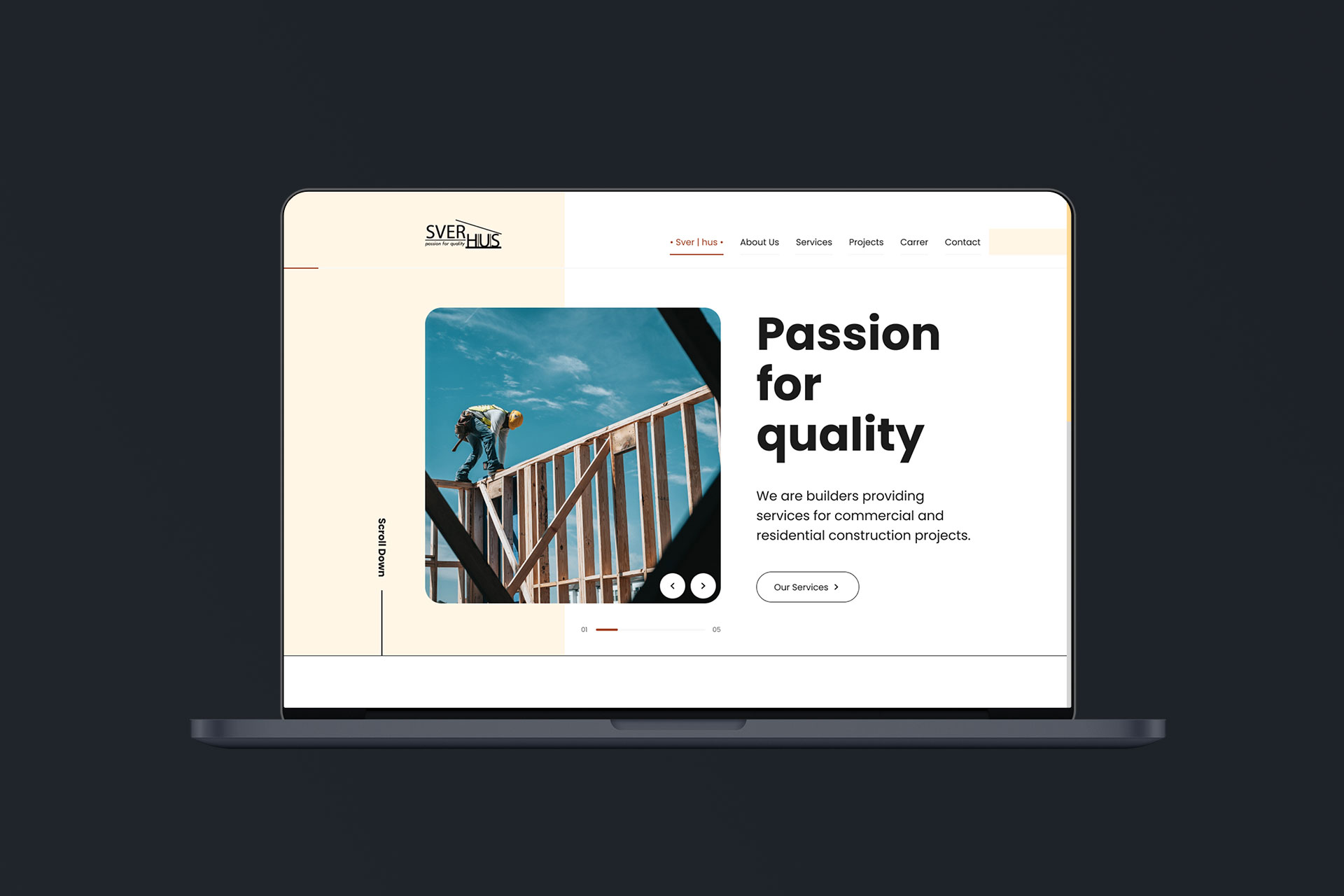
The whole site runs on a 12-column grid adapted for desktop and mobile, with a visual direction built to express “passion for quality” as an interface property – engineered, not decorated.
Grid and layout system
- On desktop, the grid gives the Services and Projects pages a steady, structured rhythm – content organised into clearly separated blocks, so each service line or project card is a self-contained scanning unit.
- On mobile, the same grid collapses into a single-column reading order with no content lost – the site is the same site, one-handed.
- The grid’s discipline suits the client’s positioning: a construction company’s website should itself feel engineered – aligned, load-bearing, nothing floating.
Visual direction – engineered, not decorated
- Structural, architectural aesthetic: strong alignment, clear section boundaries and confident straight lines borrow the visual grammar of construction – plumb lines, grids, clean joins.
- The wordmark as a system: the line that splits “Sver | hus” became a recurring motif in navigation and section framing, carrying the identity through every page instead of only the header.
- Content-forward, chrome-light: no decorative sliders or gratuitous animation – typography, spacing and imagery of real work do the talking, because construction buyers are sceptical of polish with nothing under it.
- Statistics as trust objects: the numbers – clients, projects, team members, teams – are presented as distinct, countable facts placed as trust anchors, not marketing fluff.
- Photography of actual work carries the persuasion load, replacing the industry default of stock photos of strangers in hard hats.
UX decisions for a representative site
- Paragraph content redesigned for scanning: the client’s long-form service descriptions were kept – they are genuinely persuasive – but restructured into titled blocks, lists and emphasised key phrases, so a reader can extract the argument in a skim.
- Dual-track service navigation: each audience – retail, commercial, residential, office, restaurant – gets its own legible section, so a franchise operations manager never reads past residential kitchen content, and vice versa.
- Single Project as reusable proof: a consistent template means every finished job strengthens the portfolio with minimal effort, and the design guarantees each entry looks complete.
- Contact reachable from everywhere: for a service bought through conversation, the site’s main job is to start one, so phone and contact access persist across the site.
- Career treated as a first-class page: a template with the same design standard as client-facing pages, because for a growing company talent acquisition is as strategic as client acquisition.
Responsive strategy
- Desktop carries the full brand experience for commercial clients comparing contractors during work hours.
- Mobile preserves complete content parity with a simplified rhythm – services stay scannable and contact actions stay thumb-reachable, because residential clients largely arrive on phones.
- Breakpoint behaviour is governed by the grid, so the responsive site is a reflow of the same system rather than a separate design.
Website showcase
Results
The project delivered a representative site that positions a 25 – 50 person builder with the credibility of a firm twice its size – structure, proof and clarity doing the work. The information architecture turned seven paragraph-heavy service lines into a navigable, audience-aware experience.
The projects system – index plus a reusable single-project template – compounds in value with every finished job, and the site ships a career channel most companies this size never bother to design.
Lessons & reflections
- Representative sites are conversion design too. Without a shop or a form funnel, the conversion is a phone call – every design decision ultimately serves making that call easier to decide on.
- Information design beats visual design for text-heavy clients. The most valuable work here was restructuring the client’s own words, not restyling them.
- Let the client’s trade shape the aesthetic. Borrowing the visual grammar of construction – grids, lines, structure – produced a brand-appropriate site no template could match.
- Design the parts nobody asks for. The Career page was the least requested and quietly most strategic template in the set.
Credits & links
- Design: Lukas Sabaliauskas – Graphic & Multimedia Designer, Vilnius, Lithuania