Brand / Iconography & Design Systems
Nova Icon Library
535 icons. One grid.
Brand · Iconography & Design Systems · 2026
- Year
- 2026
- Role
- Solo – icon design and library architecture
- Context
- A reusable library of 535 custom icons, built to serve both product interfaces and presentation design.
- Outcome
- One source of truth for iconography across UI screens, decks and brand scenarios – same grid, same stroke, same brand, every time.
Overview
The Nova Icon Library is a system of 535 custom icons covering everything the product interface and the presentation workflow needed – navigation, actions, media, status, and more. It is not a collection of icons; it is one library, drawn on one grid, governed by one set of rules, and made to be reused across completely different design scenarios.
Role
Solo – icon design and library architecture
Icon library
Explore all 535 icons in Figma
Open the complete component library, organised for product interfaces, presentations and brand scenarios.
View the icon library in FigmaThe problem
Every design team knows this story. Icons arrive from everywhere: a deck borrows from one free set, a UI screen from another, a client file from a third. Within a year the stroke weights, corner radii and proportions have drifted apart into visual noise – and every new screen means hunting for "the icon that matches." The fix is never more icons. The fix is one system, built to be reused.
The system
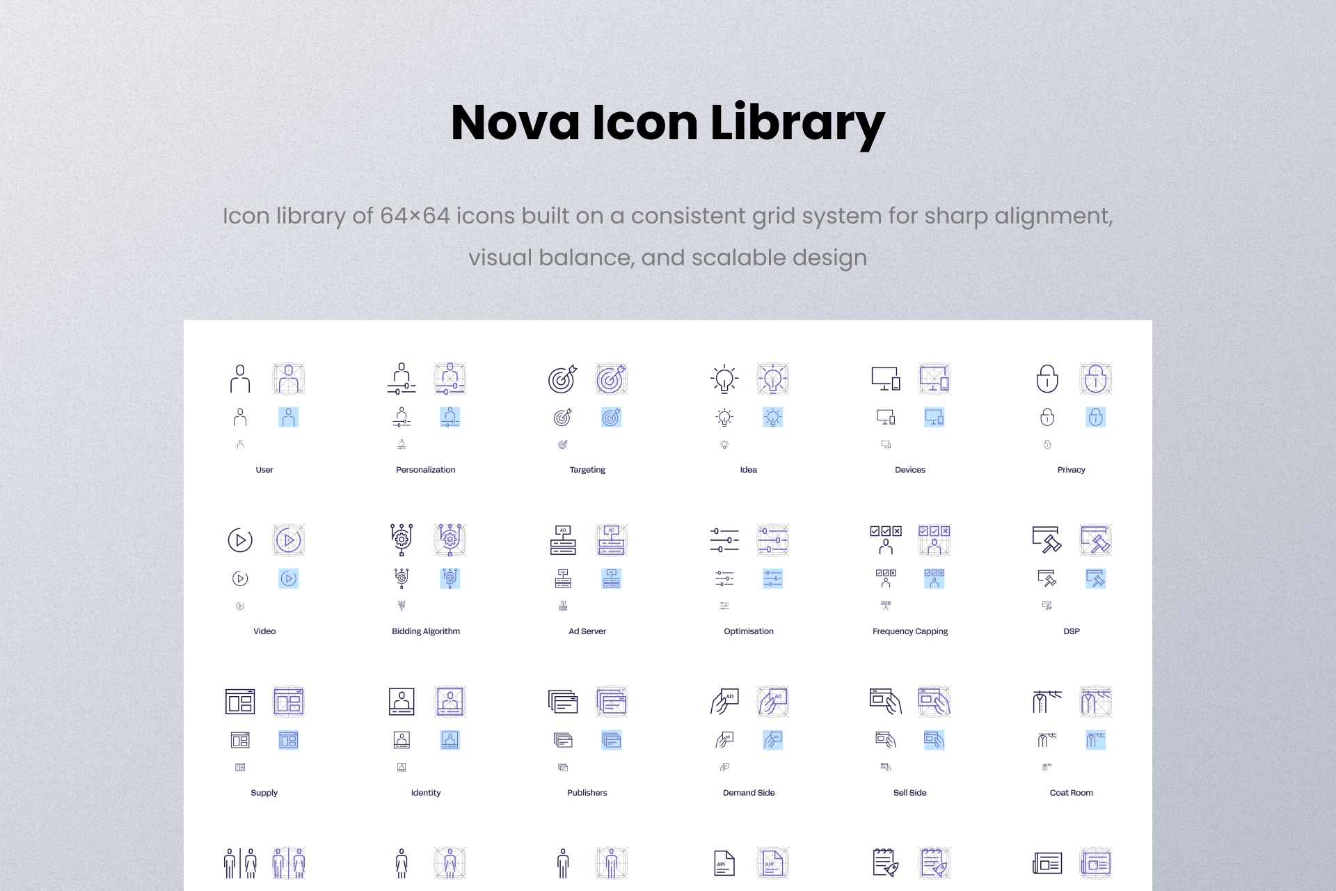
Every icon in the library is drawn on a single master grid with a consistent stroke system, so an icon designed for a small UI state holds up next to the same icon used large on a keynote slide. Each icon lives as a Figma component with consistent, intent-based naming, grouped by scenario rather than by file dump – so designers find icons by what they mean, not by what they are called.
The 2026 iteration refined the set based on real usage: tightening the categories, reworking the weakest icons, and keeping the library at 535 – a deliberate number, because a library earns trust through curation, not volume.
Built for reuse
The library was designed around two very different homes:
Product interfaces
Icons work at small sizes, in states (hover, active, disabled), inside dense layouts, and must stay legible and consistent at a glance.
Presentation design
The same icons appear at large sizes, in brand scenarios, on dark and light backgrounds, and must hold the brand without the UI chrome around them.
One library serving both means a designer building a deck and a designer shipping a screen are speaking the same visual language – without ever coordinating.
Interface showcase
The first view of the icon library is below. More screens and detailed applications will be added as the case study develops.
Why it matters
An icon library is a design system in miniature: the same thinking – grid, rules, naming, curation – applied at the smallest possible scale. Five hundred and thirty-five icons later, "where's the icon for X" has one answer, and it is always the same weight, the same grid, the same brand.
View the icon library in Figma (opens in a new tab)