Logo Design / Brand Identity
CS Hub – Logo
One brief, five directions.
Brand · Brand Identity · 2024
6 min read
- Year
- 2024
- Role
- Logo design – explorations, two design iterations and a final versatile logotype system
- Context
- An internal identity for Adform’s Creative Solutions Hub, designed for a close-knit team and the digital spaces they use every day.
- Outcome
- Delivered as a versatile logotype system adopted across SharePoint, internal project pages and team materials.
Overview
Some logos face millions of people. This one faced twenty – and that is exactly what made it a great brief.
The Creative Solutions Hub (CSH) is a team of specialists inside a large ad-tech organization: the people who build the Standard, Rich-Media and DCO (Dynamic Creative Optimization) advertising solutions, and who consult both clients and colleagues. A "hub" in the truest sense – knowledge and craft flow through them to the rest of the company.
In 2024 the team needed its own mark: a logo for their team SharePoint and internal projects pages. Not a corporate rebrand, not a consumer campaign – an internal identity. The logo had to look like it belonged to the company (compliance with the corporate style was a hard requirement) while still being unmistakably theirs. The project moved through a proper, documented process: broad symbol exploration, a first iteration the team fell in love with, a second iteration to find the mark's best working modes, and a final design delivered as a complete logotype system – vertical, horizontal, symbol-only and color-adaptive.
Role
Logo design – explorations, two design iterations and a final versatile logotype system
Client
Creative Solutions Hub (CSH) – a team of 10–20 experts inside a 500–1000 employee organization (Adform), driven by curiosity and always looking for new opportunities to learn and share knowledge across. The team creates sophisticated Standard, Rich-Media and DCO solutions and provides high-quality, in-depth consultations for clients and colleagues.
Scope
- Logo design: symbol explorations, two design iterations, final logotype system
The brief, decoded
The task on paper was short: CSH should have a new logo, for the team SharePoint and internal projects pages, compliant with the company style. Unpack it, and it is a specific design problem with unusual properties.
The audience is the client
The people who would see this logo most are the same people it represents. For internal branding, adoption is the only real success metric – a mark the team does not enjoy using is a failed mark, no matter how well-crafted. That made the team's "beloved within the team" reaction to the first iteration the project's most important design feedback.
Compliance is a creative constraint, not a cage
The logo had to sit comfortably next to the parent brand – same world, same visual family – while giving the team something of its own to rally around. Design inside a big brand means knowing exactly where the freedom lives.
A logo for screens, used daily, by experts
SharePoint headers, project page tiles, documents, video calls. Internal tools are where identity meets utility: the mark has to survive small sizes, odd crops and placement next to every kind of content.
A hub, visualized
The team's self-description – experts driven by curiosity, learning and sharing knowledge across – is a network metaphor: a central point that connects. That idea was the natural conceptual ground for symbol exploration.
The starting point
The team already had a mark of its own, but the brief was not to salvage it – it was to replace it with something deliberate: a system the team would actually choose to use.
The process
Step 1 – Symbol explorations
The project opened wide rather than narrow: a variants process exploring different symbol directions for what "CSH" and "hub" could look like. This is the divergent phase – quantity before quality, options before opinions. Each exploration tested a different answer to the same questions: What shape is a hub? How literal should the reference be? How much of the company's existing visual language should the mark borrow, and how much should it invent?
Step 2 – First iteration: the team's favorite
From the explorations, the work converged into a designed iteration – and something happened that every internal branding project hopes for: the variant was beloved within the team. The people it represented did not just accept it; they adopted it. In internal identity work, that emotional response is the equivalent of a consumer brand's recall test – proof the mark carries real belonging, not just decoration.
Step 3 – Second iteration: finding the working modes
A beloved logo is not yet a functional logo. The second pass was a deliberate step back from affection into application, with three concrete goals:
- Text alignment – testing how the wordmark and symbol lock up, since different internal placements demand different geometry
- Backgrounds – verifying the mark's legibility and presence on the surfaces it would actually live on: light and dark UI, tiles, documents
- Icon use – reducing the logo to its smallest, most demanding form: an avatar-size symbol that must still read as CSH at a glance
This is the phase where a logo stops being a picture and becomes a system.
Step 4 – Final design: one logo, many cases
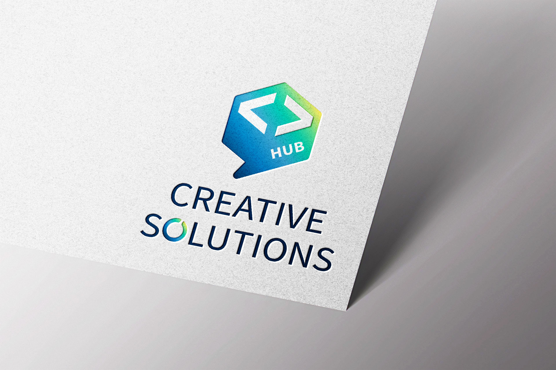
The finished deliverable: a widely applicable logotype version engineered for different cases – vertical or horizontal lockups, symbol-only use, color-change flexibility and more. Every internal scenario the team could throw at it had a pre-solved variant, so nobody would ever need to improvise a bad crop or a stretched version in a SharePoint header.
Logo system showcase
The final system in use: lockups, symbol-only applications and color variants across the surfaces the team touches every day.
What makes this project different
- Design with the audience in the room – most logo work ships to strangers; this one shipped to colleagues. Feedback was immediate, honest and invested, and the process (explore, check the room, refine) used that advantage deliberately.
- Internal brands are still brands – a 20-person team inside a 500+ employee company is a community, and communities run on identity. The logo gives CSH a flag for their corner of the intranet: visible proof that this team exists, has its own culture and takes its craft seriously.
- Constraint: parent brand. Team: their own – company-style compliance turned the project into a precision exercise: close enough to the family to be recognized as one of its own, distinct enough to be theirs.
- Versatility was the actual finish line – the brief's last mile was not "a logo" but "a logo that works everywhere it will be used", and the final system answers that directly.
Results
The logo now lives where it was born to live – on the team's SharePoint, internal projects pages and everyday team materials – and the enthusiasm around the first iteration carried through to the finished system.
- An internal mark the team embraced enthusiastically – the rare logo whose first iteration became a point of team pride before it was even final
- A complete, self-serve logotype system – no internal user ever needs to guess how to apply it
- Brand compliance without brand anonymity – distinctly CSH, unmistakably at home in the parent company's style
Lessons & reflections
- The smallest audiences give the truest feedback – twenty invested users tell you immediately whether identity work carries feeling. A million strangers never will.
- Iteration is not revision – it is a change of question. The first iteration asked "do we love it?"; the second asked "does it work everywhere?" Both questions had to be answered, in that order.
- Deliver systems, not images – the final logo's real value is the variant set: vertical, horizontal, symbol, recolored – pre-solved cases that protect the mark from future misuse.
- Design inside a brand is a craft of nuance – the space between "compliant" and "distinctive" is narrow; this project lives comfortably in it.
Credits & links
- Logo & identity design: Lukas Sabaliauskas – Graphic & Multimedia Designer, Vilnius, Lithuania
- Client: Creative Solutions Hub team (Adform)