Web Design / Branding
Eliteparty.lt
Rent the whole celebration.
Web & product · Web & E-commerce · 2024
8 min read
- Year
- 2024
- Role
- Graphic & Multimedia Designer – web design and branding.
- Context
- A web and brand system for a celebration-rental company with a broad inventory and event-decoration service.
- Outcome
- Delivered as a complete design system that turns a varied rental catalogue into a curated, orderable experience.
Overview
Eliteparty.lt is a Klaipėda-based company that rents out holiday inventory and provides decoration services for weddings, christenings, buffets and banquets, personal celebrations and business events – “creating beauty and comfort in the most beautiful celebrations in Klaipėda and throughout Lithuania.”
The project's goal was to transform the client's dated online presence into a modern, trustworthy representative website that could also work as a rental catalogue: letting customers browse a large and highly varied inventory, understand pricing at a glance, and assemble an order across many small items – from Chiavari chairs and tablecloths to glassware, candlesticks and serving stands.
The deliverable was a complete responsive design system and page architecture covering five key templates: Mainpage, Inventory, Product, Wishlist and Cart.
Role
Graphic & Multimedia Designer – web design and branding.
Client
Eliteparty.lt – holiday inventory rental and decoration company, Klaipėda, Lithuania.
Scope
Representative website and e-commerce experience on a responsive 12-column grid: Mainpage, Inventory, Product, Wishlist and Cart.
The challenge
Rental inventory is not ordinary e-commerce. It presents challenges that a standard product-shop template doesn't solve – and for a decor business, the website itself has to demonstrate the aesthetic the client sells.
Who is Eliteparty.lt?
A celebration inventory rental and decoration business serving Klaipėda and the whole of Lithuania. Their offering spans five distinct use cases, each with a different customer mindset:
- Wedding decor – the highest-stakes, most emotional purchase; couples plan months ahead and care deeply about aesthetics and coordination.
- Christening decor – family celebrations with traditional styling needs.
- Buffets and banquets – larger-scale orders for caterers and event organizers, where quantity, logistics and price-per-unit dominate.
- Personal celebrations – birthdays and private parties; price-sensitive, fast-moving decisions.
- Business celebrations – corporate events needing reliable, presentable inventory at short notice.
The core design problems
- Extreme catalogue breadth. The inventory spans chairs (€3.00–€7.00), tables (€8.00–€17.00), dozens of tablecloth variants differing only by colour, size and shape, porcelain, glassware, candlesticks, lanterns, serving stands and decor objects – hundreds of SKUs, many priced as low as €0.15.
- Micro-pricing and volume. A single napkin or dessert fork costs €0.15–€0.18. Nobody orders one. Customers think in quantities of 50–300 for a banquet, so quantity selection had to be a first-class interaction, not an afterthought.
- Attribute-driven variants. Colour, material, size and shape differences (gold vs. wood, 3.00 m vs. 3.20 m diameter) define the product as much as its name. Navigation and filtering had to work at attribute level, not just category level.
- Emotion vs. logistics. A wedding customer is buying a mood; a banquet organizer is buying unit economics. The design had to serve both without alienating either.
- A dated legacy presence. The previous site was a typical early-generation catalogue page – cramped, unstructured and hard to scan.
The old design
The legacy pages below show the starting point. For a decor company, the site is a portfolio piece – it has to demonstrate the client's own standard of beauty and taste.
Project goals
- A representative site that positions Eliteparty as a premium local brand – the site is the client's first showroom, and its aesthetic must match the aesthetic of the events they decorate.
- A browsable, filterable inventory that scales to hundreds of SKUs – customers must find “a round champagne tablecloth, 3.20 m” in seconds, not minutes.
- Frictionless multi-item ordering – banquet orders combine 10–30 different items in large quantities, so the wishlist and cart flow had to support that reality.
- Full responsiveness on desktop and mobile – event planners browse on desktop; private customers browse on their phones after work.
- Clear, honest pricing presentation – prices include VAT and are quoted per item per day; transparency had to be built into the product template.
Information architecture
The site was structured around five templates, chosen to mirror the customer journey from inspiration to order:
1. Mainpage
Brand statement, service categories (weddings, christenings, buffets, personal and business celebrations), a curated showcase of inventory, and contact and trust signals. Its job: convert a visitor into a browser within one screen.
2. Inventory
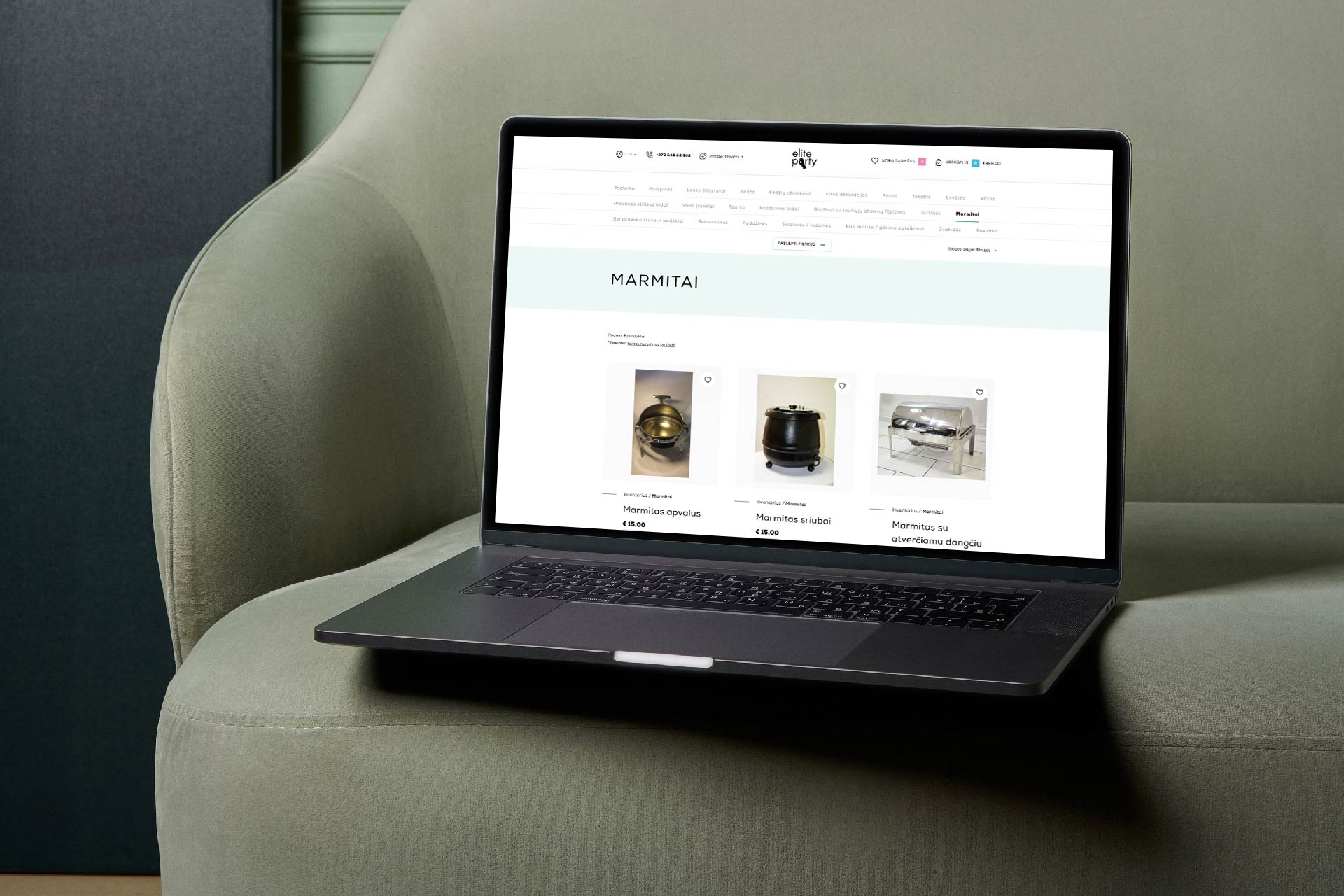
The full rental catalogue, organized by category with attribute-level filtering (category, colour, size, shape, material), designed so the extreme SKU variety stays navigable. Each listing carries name, key attributes and price – enough to compare items without opening them.
3. Product
The detail template: large product imagery, attribute variants (colour, material, dimensions), a quantity selector, per-item price with VAT noted, and an “UŽSAKYTI” (order) action. Related items encourage building out a full table setting – a napkin page naturally leads to a tablecloth page.
4. Wishlist
A planning space between browsing and ordering – critical for this business, because wedding planners and event organizers collect items over days or weeks before committing. The wishlist lets them park selections and return.
5. Cart
The final assembly point, designed for orders of 10–30 line items in large quantities, with per-line quantity editing and a running total that keeps unit costs visible.
This journey – browse, save, assemble, order – reflects how rental customers actually behave, rather than forcing the impulse-buy model of standard e-commerce.
Design solution
The branding task was to translate “beauty and comfort at celebrations” into concrete interface decisions – a system where the inventory itself carries the colour and the interface stays out of its way.
Grid and layout
The entire site is built on a 12-column grid, adapted for desktop and mobile breakpoints:
- On desktop, the grid gives inventory pages a consistent multi-column rhythm for dense product listings while keeping the mainpage airy and editorial – 12 columns flex between 4-up and 3-up product rows without breaking alignment.
- On mobile, the grid collapses cleanly so the catalogue remains scannable one-handed; quantity controls and the order action stay thumb-reachable on the product page.
- The same grid discipline governs the mainpage hero, category cards and footer, so every page reads as one system.
Visual and brand direction
- An elegant, restrained palette – the inventory itself spans ivory, champagne, gold, burgundy and muted pastels, so the interface stays neutral and warm and lets product photography carry the colour.
- Elegant, airy typography – generous spacing and refined display accents paired with a clean workhorse sans for dense catalogue data, so the site feels like an event brochure rather than a warehouse list.
- Image-led product cards – the item photo is the hero of every card, with name, attributes and price in a strict secondary hierarchy. Customers visually match items to their event's aesthetic, which is exactly how decor is actually chosen.
- Consistent componentry – buttons, attribute chips, quantity steppers and price tags reuse one component language across Inventory, Product, Wishlist and Cart, so the multi-step ordering flow feels continuous rather than like four different pages.
UX decisions specific to rental
- Quantity as a first-class control. With per-item prices from €0.15, the quantity stepper on the product page is as visually prominent as the add-to-cart action itself, and quantity remains editable per line in the cart.
- Variant presentation. Where items differ only by colour or size (tablecloths, napkins, chair covers), variants appear as selectable attribute chips on one product page rather than as separate listings – keeping the catalogue compact and comparable.
- Standardized spec data. Every product lists dimensions, diameter, material or capacity in a consistent format (“Diameter 3.20 m”, “250 ml”, “100% cotton”) – for rental logistics, the spec is the product.
- Transparent pricing. Prices are presented per item with VAT included, stated directly on the product template – eliminating the single most common pre-order hesitation.
Responsive strategy
- Desktop-first browsing depth for event professionals comparing options side by side.
- Mobile-optimized flow completeness – a customer can go from first browse to a complete wishlist or cart entirely on a phone, since private-celebration customers overwhelmingly arrive mobile via social media.
- Consistent grid collapse rules mean no content or controls are hidden or relocated between breakpoints – the mobile site is the same site, not a reduced version.
Website showcase
Responsive pages adapted for desktop and mobile screens, based on a 12-column grid. Click any thumbnail to open the gallery view.
Results
Qualitatively, the project delivered a complete design system that turns a highly varied rental catalogue into a curated, orderable experience.
- A unified brand and interface system that lets a 100+ SKU rental catalogue feel curated rather than cluttered.
- An ordering flow (Product → Wishlist → Cart) built for the real shape of rental orders: many line items, high quantities, planned over time.
- A representative site whose own aesthetic argues for the client's core promise – beautiful celebrations.
Lessons & reflections
- Rental is a distinct e-commerce genre. Patterns borrowed from retail – single-unit impulse purchases – actively hurt here; designing for assembly over time (wishlist-driven) matched real customer behaviour far better.
- Attribute-level information design does the heavy lifting. When products differ by colour, size and shape, the filter and variant system is the user experience – it deserved as much design attention as any hero section.
- For a decor business, the website is a portfolio piece. The strongest branding argument the site can make is demonstrating the client's own aesthetic standard; restraint in the UI lets the product photography do the persuading.
- A 12-column grid earns its keep on catalogue-heavy sites. Dense inventory pages, editorial mainpage sections and checkout flows all stayed coherent because they shared one grid logic.
Credits & links
- Design: Lukas Sabaliauskas – Graphic & Multimedia Designer, Vilnius, Lithuania
- Client website: eliteparty.lt
- Facebook: facebook.com/elitepartylt