Single projects – pieces
Studies, artworks
& side experiments.
Not all good work comes from a brief. Studies & Artworks is the other side of a design practice – single-piece projects made in free time, purely to explore techniques, styles and ideas without a client, deadline or deliverable attached. A deliberately broad field across seven threads, because the point was not to specialize in one technique but to stay fluent across many.
Vilnius, Lithuania – working across Lithuania & the EU
Click any thumbnail to open the gallery view.
The purpose of self-initiated work
The purpose of this body of work is simple: a designer gets better by making. Every piece here is an experiment with something – a rendering style, a composition rule, a type treatment, a cultural reference translated into a poster. Together they form a visible record of curiosity and skill development across the main disciplines of graphic and multimedia design.
Client work answers the question “can you solve this problem?” Self-initiated work answers a different one: “what can you do, and what are you interested in?” This part of the portfolio serves three functions.
- Practice space. Techniques get tested here first – flat colour planes, liquid RGB gradients, pixel-art rendering, isometric construction – before they inform client projects. Low stakes, high learning.
- Range on display. A single gallery shows poster design, character illustration, logo design, vector portraiture, UI concepts and pixel art side by side. For a multimedia designer, breadth is part of the offering.
- Voice and taste. Without a brief dictating direction, what gets made – and how – reveals the designer’s own sensibility: the recurring love of flat geometry, limited palettes, tribute pieces to music and film, cars and pop culture.
What’s in the collection
The pieces cluster into several recurring threads.
Posters & print design
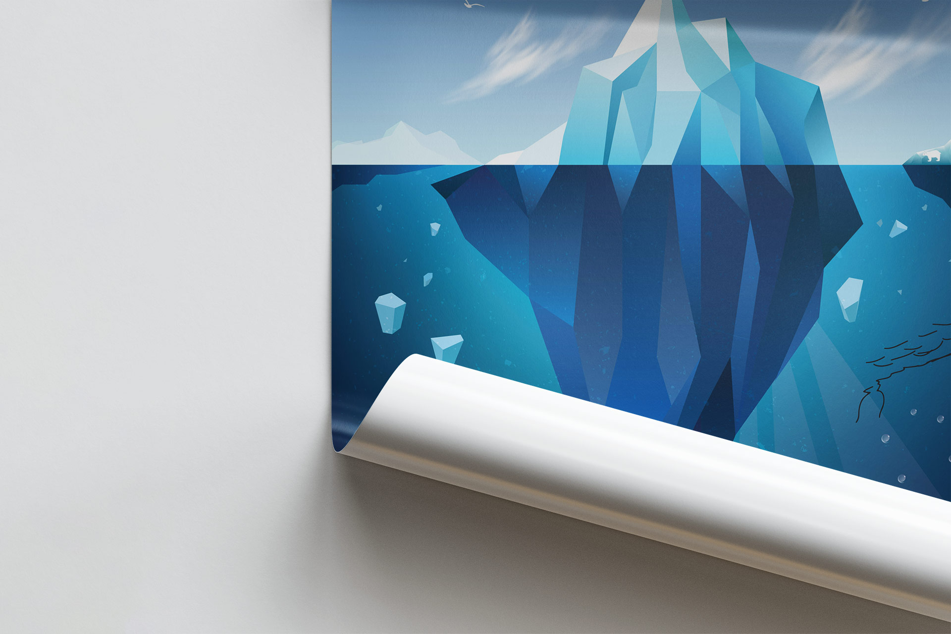
The largest thread. Abstract posters built from layered geometric shapes in limited palettes; A2/A3 typographic posters; a reinterpretation of Munch’s The Scream as flat colour planes; poster series shown as sets, framed gallery mockups and branding mockups – because a poster isn’t finished until it exists in context. A dedicated poster explaining the C.R.A.P. design principles (contrast, repetition, alignment, proximity) turns theory itself into a piece of design.
Music & film tributes
Cultural translation as a design exercise: Pink Floyd’s The Dark Side of the Moon, Tron Legacy neon, Daft Punk helmets as a wall composition, a Star Wars: The Force Awakens tribute poster. Each takes a known visual language and rebuilds it in a different technique – a reliable test of how well style can be abstracted and re-rendered.
Vehicles in flat vector
Flat vector portraits of machines with cult followings: Ferrari F40, Porsche 911, Mini Cooper, Lotus E21 F1 car, a stylised racer, a retro spaceship. Reducing a complex 3D object to clean flat planes is a recurring study in simplification and shape economy – the same skill that underpins good iconography and illustration.
Pixel art
A whole technique lane of its own: Sonic on SEGA, Space Invader, Iron Man, a Photoshop icon, character studies and a pixel wall of small characters. Pixel art is rendering under hard constraints – every pixel has to be placed deliberately – and those constraints sharpen composition and colour decisions that carry back into higher-resolution work.
Character & playful illustration
Minions, a kawaii yeti, BB-8, Adventure Time, an ice cream piece, a meme-inspired character study, Halloween and Christmas pieces. Proof that the practice isn’t only serious: play is a legitimate design exercise, and clients in entertainment, retail and events need exactly this register.
Identity & UI studies
A logo for MUNE beauty studio; a Cadbury slot-machine game UI concept; a full-page website wireframe; a set of flat interface icons; an illustration about coding for the web. These bridge the gap between artwork and applied client work – branding, product and web design represented in miniature.
Technique studies
Isometric scenes built from simple blocks, a “Hello, World” typographic study, an LS monogram in liquid RGB gradients, a landmark illustration, continuous-line holiday greetings. Small, focused exercises on one technique each.
Outcome
No client, no metrics – and that’s the point.
The outcome of this segment is fluency: a demonstrated ability to move between print and screen, flat and pixel, serious and playful, minimal and ornamental, and to bring any of those registers to a client brief on request.