Branding
Mia San Litauen
Bayern values, Lithuanian soul.
Brand · Brand & Campaign · 2022
5 min read
- Year
- 2022
- Role
- Graphic & Multimedia Designer (branding) – logo design as the core, plus artworks, clothing design, graphic design, stationery and print applications.
- Context
- A complete identity for Lithuania’s first official FC Bayern München fan club, balancing fan culture with distance from the parent brand.
- Outcome
- Delivered as a distinct, trademark-conscious identity spanning the logo, clothing, stationery, print and digital artwork.
At a glance
Overview
"Mia San Litauen" is the first official and approved FC Bayern München fan club in Lithuania, operating as FC Bayern Lietuva in Vilnius. Its mission is to unite Bayern fans in Lithuania, share news about the club and keep fan discussion mutually respectful. In 2022 the club needed what every fan community eventually needs if it wants to be more than a Facebook group: a real identity – a logo to rally around and a visual language flexible enough to live on a scarf, a letterhead, a matchday poster and a member tee, all at once.
Role
Graphic & Multimedia Designer (branding) – logo design as the core, plus artworks, clothing design, graphic design, stationery and print applications.
Client
FC Bayern fan club "Mia San Litauen" / FC Bayern Lietuva, Vilnius, Lithuania.
Visit Facebook Page (opens in a new tab)The name is already a brand decision
Before a single sketch, the identity had a gift: the name. "Mia san mia" is FC Bayern's famous Bavarian motto – "we are who we are", the club's whole ethos in three dialect words. "Litauen" is simply "Lithuania" in German. Swap the second "mia" for "Litauen" and the name says: the same ethos, transplanted to Lithuania.
It declares belonging to the Bayern family while being unmistakably Lithuanian – not a branch office, but a member with its own address. That naming logic became the brief for the whole identity: fuse the two loyalties, the club and the country, visibly and with affection, without pretending to be either one alone.
The design problem
- You cannot copy the mother brand. FC Bayern's crest, wordmark and red Rauten pattern are fiercely protected trademarks, and official approval means the fan club identity has to stay on the right side of that line – signalling Bayern at a glance without imitating it.
- You cannot ignore the mother brand either. A Bayern fan club logo that doesn't feel like Bayern fails its only audience, so the design lives in deliberate tension: recognisable lineage, independent mark.
- Two flags to fly. The club is doubly anchored – to FC Bayern and to Lithuania. National identity had to be present, not decorative.
- Wildly varied applications: clothing worn to pub screenings, stationery for the club's officialdom, print posters and matchday announcements, and fan artworks where the identity gets to breathe.
- An audience with maximum brand literacy. Football fans read identity details the way designers read kerning – subtle references land, lazy ones get called out instantly.
The logo
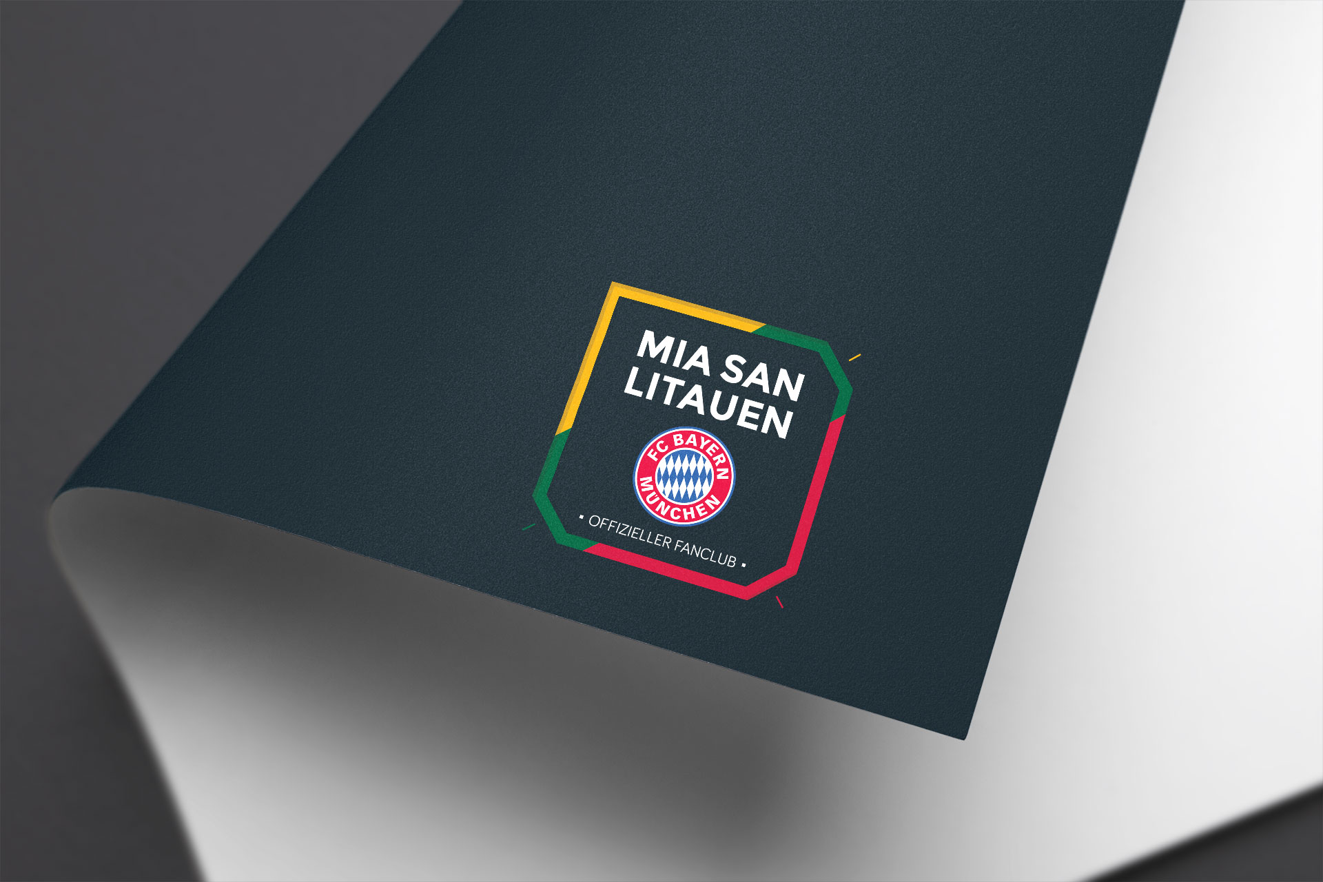
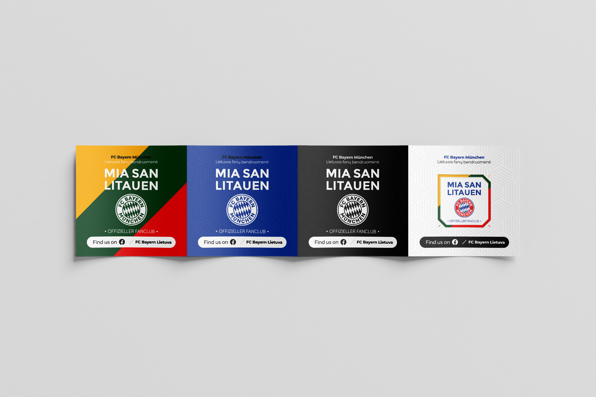
The logo is the anchor of the project – the single asset every other usage is derived from. Its job, straight from the naming logic, is the visual equivalent of "Mia San Litauen": one mark holding the club's Bavarian lineage and Lithuania's identity in balance, built on diamond geometry and the red-and-white palette that reads as Bayern, resolved with Lithuanian colour and national cues so the two are fused rather than collaged.
It was drawn to stay legible as an embroidered patch on a jacket sleeve, as a small social avatar, and at full glory on a print poster – with a gold anniversary variant and a later refined version kept in the same family.
The system across usages
Clothing design
Fan apparel is a fan club's flag bearer – identity worn in public. The mark and supporting motifs were prepared for garment reproduction: bold, limited-colour, built around textile print and embroidery constraints across hoodies, jumpers and tees.
Print designs
Posters and campaign pieces gave the identity a stage: larger formats, bigger typography and room for the matchday energy of Bundesliga visual culture.
Stationery design
Official approval is itself a credential, so stationery treats the brand with institutional calm: smaller scales, cleaner hierarchy, the logo working at its strictest and smallest.
Graphic design & artworks
The flexible middle of the system – matchday graphics, birthday posts, podcast covers, flags and stickers, where the visual language plays more freely and gets tested for how far it stretches without losing recognition.
The underlying principle is one identity, many registers: the system defines what stays fixed – the mark, key colours, core motifs – and what is free to flex, such as composition, scale and energy, per usage.
Branding visuals
Scroll through the showcase below. Click any thumbnail to open the gallery view.
Results
A complete, distinct identity for the first official FC Bayern fan club in Lithuania – one that passes the dual test of fan approval and trademark-safe distance from the mother brand.
- A logo and system proven across the hardest test in branding: extremely varied applications, from embroidery to print to digital, without losing coherence.
- A visual identity with a built-in story – the bilingual pun of the name carried through into the mark, so every artifact explains itself.
Lessons & reflections
- Fan culture branding is diplomacy. The best result isn't the prettiest mark – it's the one members feel ownership of and the mother brand's lawyers shrug at.
- The name was the strategy. "Mia San Litauen" already contained the brief – belonging plus distinction – so the identity's job was to visualise the name.
- Design the system for the hardest usage first. A logo that survives a scarf weave, a social avatar and a letterhead exists because the tough cases were treated as the real brief.
- Audiences with high brand literacy reward depth. Fans notice the references, and designing for people who read the details raises the whole project's ceiling.
Credits
Branding & design: Lukas Sabaliauskas, Graphic & Multimedia Designer, Vilnius, Lithuania. Client: FC Bayern fan club "Mia San Litauen" / FC Bayern Lietuva, Vilnius.