Branding / Logo / Print
Perfe.lt
Keto, made appetizing.
Brand · Brand & Print · 2022
5 min read
- Year
- 2022
- Role
- Graphic & Multimedia Designer (Branding / Logo / Print)
- Context
- A restaurant identity designed to make a specialist keto offer feel welcoming to both committed keto diners and a mainstream audience.
- Outcome
- Delivered as a durable identity system used across dine-in, takeaway, banquets, catering and daily print materials since 2022.
At a glance
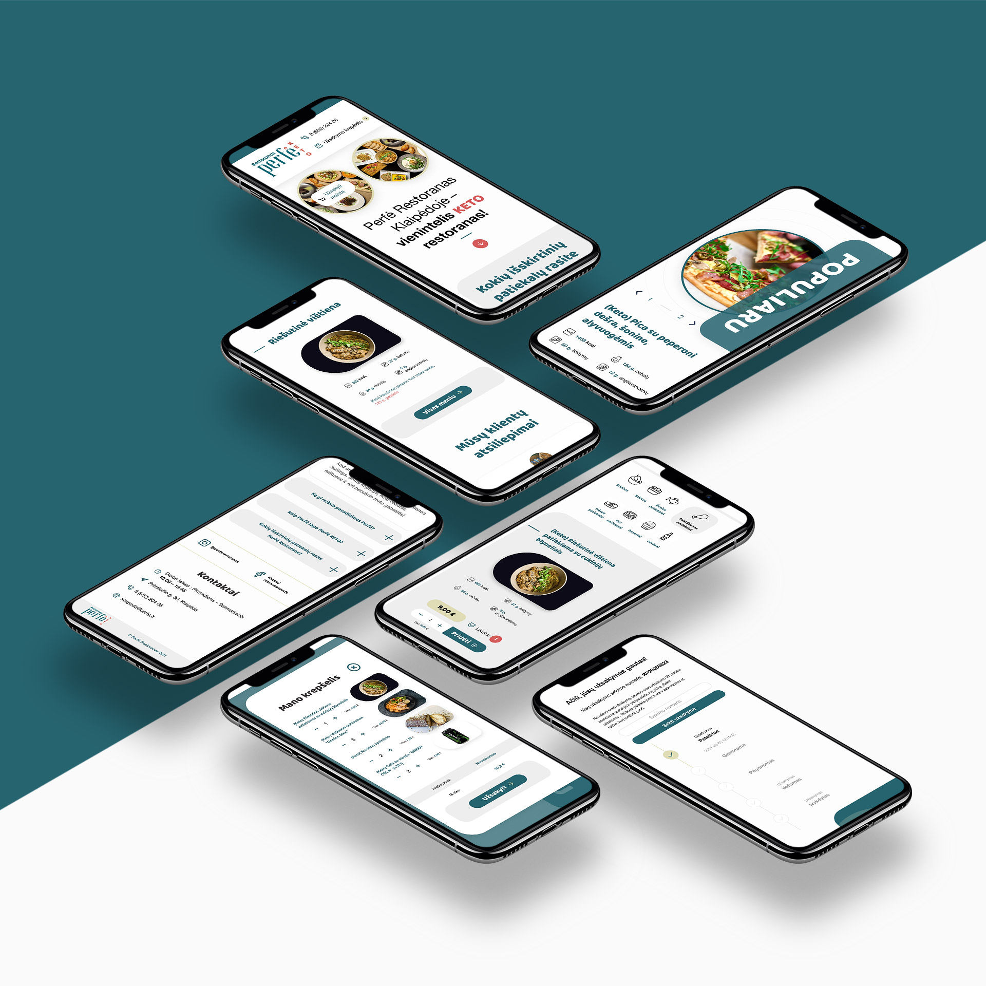
Overview
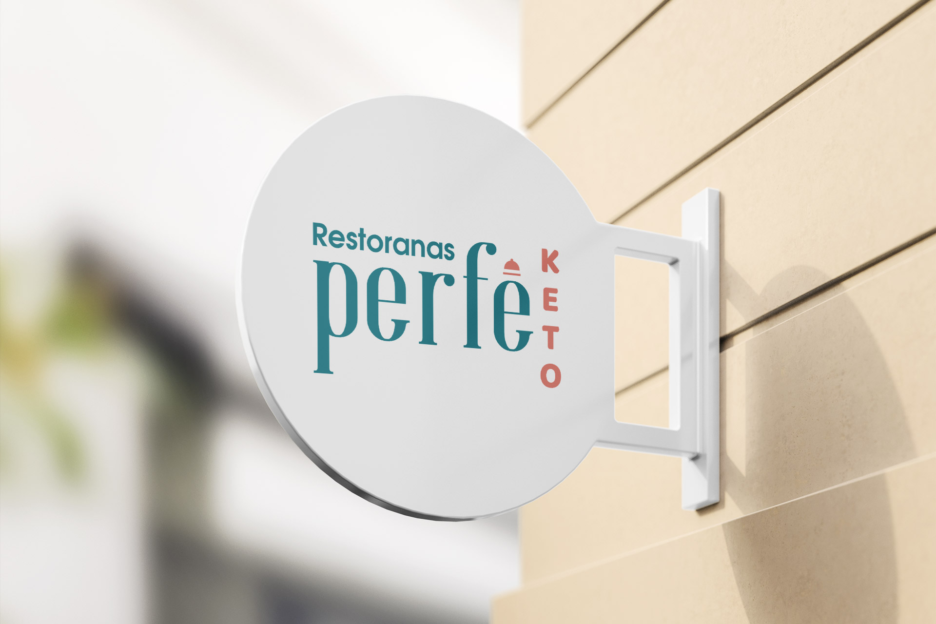
Perfė is a restaurant in Klaipėda built on a category contradiction: it’s a KETO restaurant whose own promise is “keto ir ne tik – patiekalai patinkantys visiems” – keto, and not only; dishes that everyone likes.
That contradiction is the brand. Restaurants built around a diet usually end up looking like pharmacies – macros on the menu, “guilt-free” tropes, clinical green-and-white palettes, and an unspoken “members only” air. Perfė needed the opposite: an identity that makes a mainstream diner feel invited, while quietly telling the keto community “we’re the real thing.”
The 2022 branding engagement covered the logo, the identity system, and the print works a physical restaurant actually runs on – menus, promo pieces, celebration and event materials. This is the study of how that identity was built; the website and e-commerce work is a separate companion project.
Role
Graphic & Multimedia Designer (Branding / Logo / Print)
Client
Perfė KETO restoranas – Priestočio g. 30, Klaipėda, Lithuania
Scope
Logo design, brand identity, and various print design works – menus, promotional pieces, celebration and banquet materials, gift vouchers.
Reading the name
“Perfė” – a Lithuanian-styled diminutive that reads as “perfect” with a local accent: perfektiškai. The name carries the whole brand thesis in one word.
Perfection of craft
Perfė isn’t “diet food done right” – it’s food done right, which happens to be keto. The name claims the quality register, not the nutrition register.
Local, not clinical
The -ė ending makes it feel like a place, a person, a name you could call across the street – not a science or a system. It sounds like a restaurant, because it is one.
A wink at the audience
For keto folks, “the perfect keto place”; for everyone else, just “the perfect little spot.” One name, read differently by each audience – and flattering to both.
A name that two audiences read differently but both like is the strongest raw material a brand can get. The identity’s job was to keep that dual reading alive everywhere the brand touched.
The brand problem
The keto category’s visual baggage
Keto’s public visual language – borrowed from dieting culture – is a liability for a restaurant: scales, measuring tapes, macro percentages, “before/after” energy, green-and-white clinical minimalism. All of it says restriction. None of it says come celebrate your anniversary here.
The identity had to leave that entire vocabulary at the door and borrow from a different genre: European hospitality. Warm, confident, appetite-led – a restaurant brand that happens to fit keto, not a keto brand that happens to have a dining room.
The double audience, again
- Keto believers need signals of authenticity: the brand can’t go so mainstream it looks like a gimmick – “keto-washing.”
- Mainstream diners need signals of safety: the brand can’t look like a members’ club for a specific diet.
- The needle it threads: keto as kitchen philosophy, hospitality as business model.
Print is where a restaurant brand is tested
A restaurant logo lives in a portfolio; the brand lives on the table. Perfė’s print reality includes menus handled nightly (dim light, busy hands), seasonal and holiday promos – the restaurant runs dessert campaigns, celebration offers, collaborations with Lithuania’s keto content community – plus banquet and event materials, and gift vouchers, the brand’s most physical, most public artifacts. Print had to be designed for that wear, not just for the brand presentation.
Identity system
The system’s guiding rules, consistent with the positioning:
- Appetite is the hero. Every brand artifact leads with food desire – texture, plate craft, generosity. Keto is a fact on the menu, not the headline of the identity.
- Hospitality warmth over dietary coolness. Colors, type, and materials chosen to read as evening, taste, and welcome – the emotional register of a good restaurant, not a nutrition plan.
- Craft signals authenticity. The keto audience trusts craft – a brand that visibly cares about detail implies a kitchen that does too. Precision in typography and layout doubles as the authenticity signal the believers need.
- Flexibility for occasion. The same system stretches from a Tuesday takeaway flyer to a banquet inquiry folder to a Mother’s Day dessert promo – tone flexes, identity doesn’t.
Print design works
Print was a first-class deliverable, not brand collateral.
Menu design
The restaurant’s most-touched, most-judged object: structured for fast scanning, appetite-forward, and built for reprint cycles when the seasonal kitchen changes.
Promotional pieces
Dessert campaigns, holiday offers, and partnership promos with the keto content community – designed to feel like invitations, not diet advice.
Celebration & banquet materials
Perfė actively courts events – banquet inquiries and the “traveling kitchen” catering service with its own chefs. The brand’s warmest register lives here, where the mainstream audience actually meets it.
Gift vouchers
The brand’s physical ambassadors that leave the restaurant in someone else’s pocket – the identity has to survive being a gift.
Branding & print showcase
Results
Qualitatively, the identity resolved the category contradiction the restaurant was built on – and the system has held up in daily service since 2022, across dine-in, takeaway, banquets and catering.
- A brand that resolved the category contradiction: keto credibility for believers, plain hospitality for everyone else – with zero diet-culture clichés.
- A name-plus-identity system that reads as “perfect little restaurant” to the mainstream and “the perfect keto place” to the community – the dual reading intact and working.
- A print system designed for the physical realities of restaurant service, not just the brand presentation.
Lessons & reflections
- Category escape is branding’s quiet superpower. The decision to ignore keto’s visual genre entirely – and borrow from European hospitality instead – is what let the restaurant sell to everyone, not just the converted.
- A name that flatters two audiences is a strategy you can design with. “Perfė” gave the identity its dual-reading principle; every later decision just had to protect it.
- Print is the brand’s handshake. In a restaurant, the menu and the promo are the brand experience for most guests – treating print as a core deliverable is treating the brand seriously.
- Craft is content. Visible care in the identity does persuasive work no tagline can: it tells both audiences – the believers and the skeptics – that the kitchen takes quality seriously.
Credits & links
- Branding, logo & print design: Lukas Sabaliauskas – Graphic & Multimedia Designer, Vilnius, Lithuania
- Client: Perfė KETO restoranas, Klaipėda