Branding / Logo / Print / Web
Romdera Klaipėda
A name that argues its case.
Brand · Brand & Print · 2021
6 min read
- Year
- 2021
- Role
- Graphic & Multimedia Designer (Branding / Logo / Print / Web)
- Context
- A brand, print and web system for a long-running Klaipėda catering company whose strongest work had remained largely invisible.
- Outcome
- Delivered as a visible identity built around the company name, supported by practical print, service and web applications.
At a glance
Overview
UAB Romdera is a catering company in the Klaipėda region that has quietly fed the city's industrial backbone for over a decade – including contract catering for companies like AB LOTOS Geonafta and other major regional employers. Its service map spans daily delivered lunches (packaged at 85°C into sealed Duniform thermal containers, carried in thermo boxes), four lunch cafeterias (pietavietės) across Klaipėda and Gargždai, banquets and receptions, picnics, coffee breaks, school and camp catering, and even funeral lunches – the full lifecycle of how a community actually eats.
In 2021, the company engaged a full identity program: logo, brand system, stationery, print design works, and a responsive website. This is the branding story – how a contract caterer, whose brand until then lived mostly on styrofoam lids and requisition forms, got an identity equal to the scale of what it actually does.
Role
Graphic & Multimedia Designer (Branding / Logo / Print / Web)
Client
UAB Romdera – catering company, Klaipėda district, Lithuania. A later, separate Romdera.lt web project exists in the portfolio; this study covers the 2021 branding engagement.
Scope
Logo design, brand identity, graphic design, stationery design, print design works, and a responsive website (desktop and mobile).
The brand hiding in the name
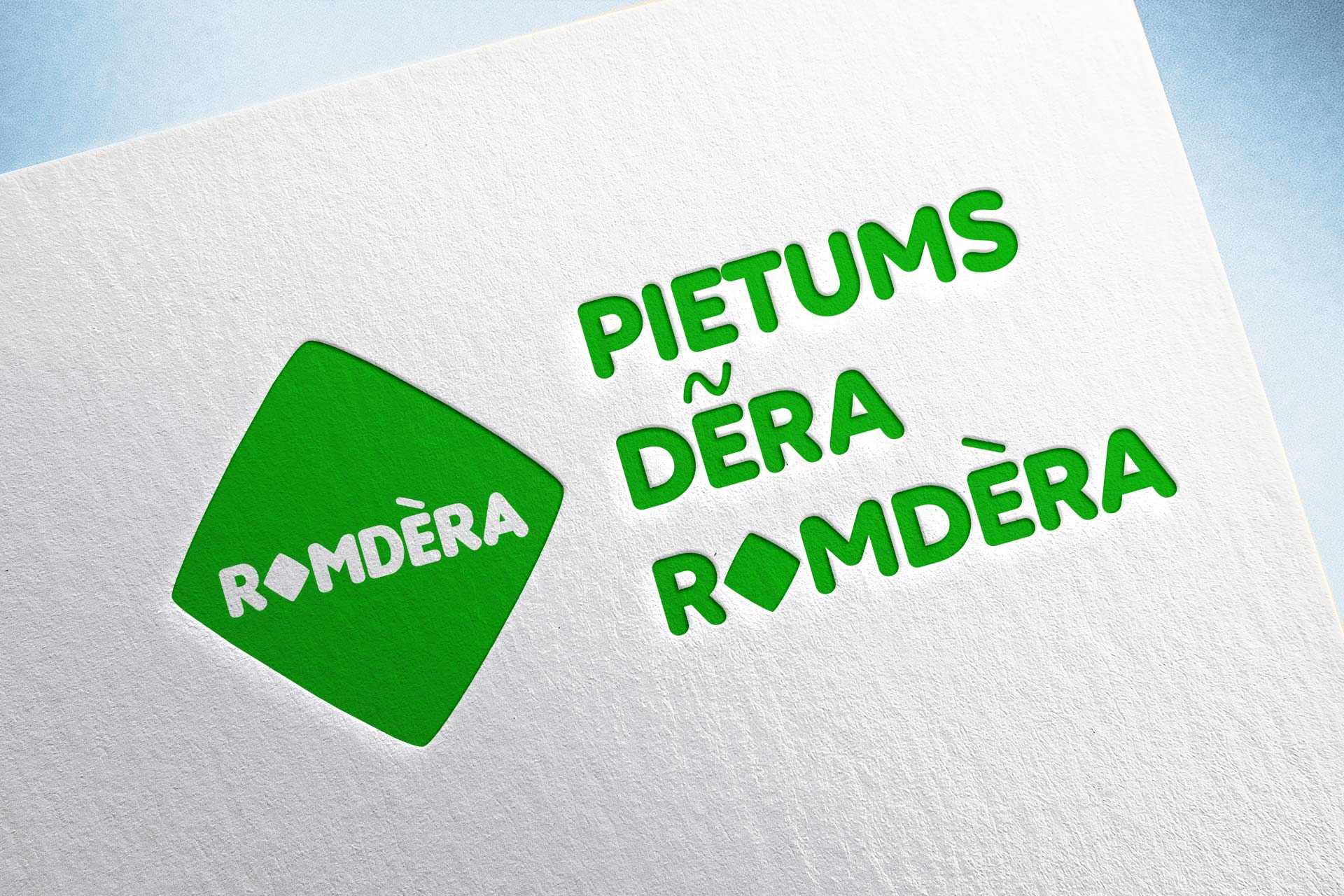
The identity's strongest asset was already sitting in the company's name. “Romdera” contains the Lithuanian verb “derėti” – to be fitting, proper, appropriate; to do things as they should be done. The brand's entire verbal identity grows from that root, as its campaign lines prove:
- #PietumsDeraRomderoje – “For lunch, Romdera is where you should be”
- #DeraApsilankytiRomderoje – “One ought to visit Romdera”
- “Dera patikėti šventinius rūpesčius mums” – “You should entrust your celebration worries to us”
This is a rare and valuable branding situation: a name that isn't an empty sound but a working word. The verbal identity – the confident, slightly folksy Lithuanian voice that tells you what befits – predates the visual one, and the visual identity's job was to make that voice visible: properness as a promise. A brand called Romdera, speaking in “der-” statements, has to look like a company that does things correctly: punctual delivery, correct temperature, sealed hygiene, honest portions, printed weekly menus that arrive on time, every week.
The branding problem
Contract catering is an invisible brand
Romdera's customers mostly never choose it the way they choose a restaurant. A company negotiates a catering contract; employees open a box. The brand's real touchpoints are operational, not promotional:
- a weekly menu pinned to a fridge or dropped on a desk – every single week;
- a sealed lunch container arriving at the agreed time, in the agreed state;
- a cafeteria door sign in an industrial district;
- stationery, order forms, invoices – the paper backbone of B2B catering.
In this genre, branding isn't decoration – it's trust made visible. The identity has to tell an office manager deciding on a vendor: this company is organized, consistent, and serious about quality. And it has to tell a worker at 12:30: this lunch is something proper, not an afterthought.
Two buyers, one brand
- The B2B buyer (office/operations manager, procurement) evaluates: reliability, hygiene, logistics, consistent weekly menus, contractual seriousness. The brand must look like an institution they can depend on – because their own reputation rides on the choice.
- The end eater (employees, families ordering funeral lunches, event guests) evaluates: taste, generosity, warmth. The same identity must look appetizing, not bureaucratic.
Print is the daily interface
For a catering company, print isn't collateral – it's product surface. The weekly menu is the single most repeated brand artifact the company produces (52 editions a year, every year), and it's often the only Romdera-branded object a lunch customer ever holds. Stationery and forms carry the institutional trust. Print design here is designing the company's daily handshake – and it must survive photocopying, fridge doors, and a decade of repetition without exhausting itself.
Identity system
The system's governing rules, consistent with the verbal brand:
- Properness as visual character – clean grids, disciplined typography, an identity that looks punctual: the visual equivalent of the “der-” voice. Nothing sloppy can carry the word “befitting.”
- Appetite alongside institution – warm food photography and a generous register balance the institutional B2B side; the brand must look equally credible on a delivery contract and a menu header.
- Repetition-proof design – a weekly menu template robust enough to be re-issued every week for years; a stationery system where the logo carries invoices and order forms with the same authority as the door sign.
- Print-first thinking – the identity was built for the artifacts it actually lives on – menus, forms, stationery, signage – with the website as its digital reflection, not the other way around.
Print & stationery works
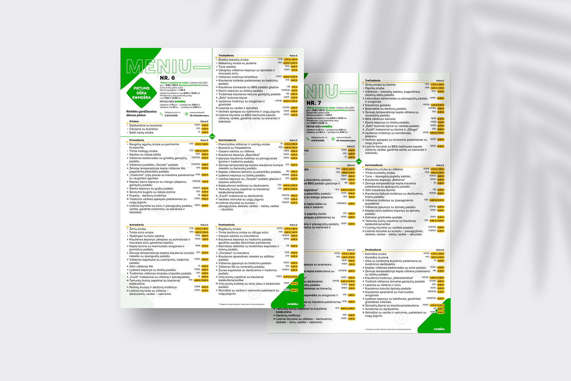
Weekly menu design
The flagship artifact: structured for fast scanning (soup, main, choices), designed for weekly reprint without visual fatigue, and carrying the brand voice into every office and cafeteria it reaches.
Stationery system
The institutional layer: correspondence, order forms, and documentation that make a family company look like the dependable organization it is – decisive for B2B procurement audiences.
Service materials
Pieces supporting the full service map: banquet and event offerings, picnic and celebration services, delivered-lunch logistics. The breadth of the offer – from a Duniform lunch to a wedding banquet – had to read as one coherent company.
The website
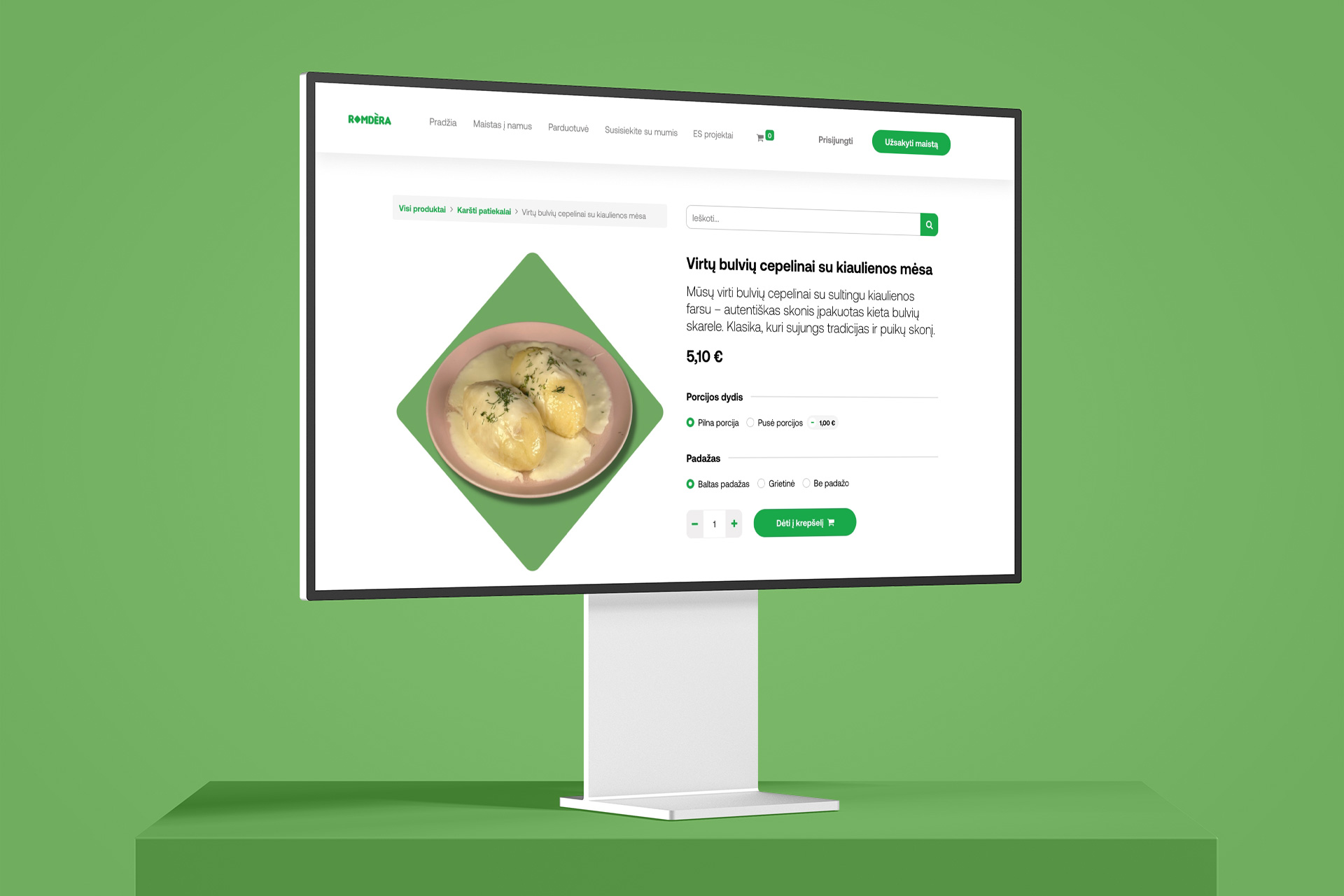
The responsive website (desktop and mobile) translated the identity into the company's digital counter:
- The weekly menu published online – the same flagship artifact, now reachable from a work computer at 10 a.m., which is exactly when lunch decisions get made.
- Ordering by phone, prominently surfaced – the company's actual ordering mechanic, given the respect of a primary call-to-action rather than being buried in a footer.
- The full service map – delivered lunches, cafeterias (all four locations with addresses), banquets, picnics, school catering – so the brand's true scale is visible in one scroll, not reduced to “a lunch delivery company.”
A note that completes the brand picture: Romdera's event services openly recommend celebration-decoration partner Elite Party – a Klaipėda sibling client. The region's celebration ecosystem, cross-referenced between two brands.
Branding, print & web showcase
Explore the showcase below – click any thumbnail to open the gallery view.
Results
Qualitatively, the 2021 identity program delivered a visible identity for an invisible brand – a contract caterer equipped to look as reliable as its twelve-year track record, with a system built around the “der-” verbal asset and print designed as the company's real daily media. The measured outcomes (client feedback, how the weekly menu system has held up, B2B contract wins where the brand played a role) will be added here when available. The project delivered:
- A visible identity for an invisible brand – a contract caterer equipped to look as reliable as its 12-year track record.
- A visual system built around a verbal brand asset (the “der-” voice), making the company's promise – properness – visible in every artifact.
- Print and stationery designed as the company's real daily media, not as decoration around them.
- A responsive site that reflects the full service map and the company's actual ordering habits.
Lessons & reflections
- Find the word already inside the name. Romdera's “der-” root gave the whole program its voice; the design work was amplifying an asset the company already owned, not inventing one.
- B2B brands are bought on evidence, styled by design. The weekly menu, the form, the container seal – for a contract caterer, the operational artifacts are the brand. Designing them properly is designing trust.
- Design for repetition. Any identity can look good once; a weekly artifact must look good the 500th time. Repetition-proof simplicity is the craft skill this project demanded most.
- One region, one network. Klaipėda's celebration ecosystem – caterer, decorator, venues – is a small world where brands refer to each other. Good identity work in one client compounds into the next.
Credits & links
- Branding, logo, print & web design: Lukas Sabaliauskas – Graphic & Multimedia Designer, Vilnius, Lithuania
- Client: UAB Romdera, Klaipėda
- Client website: romdera.lt