Banner Design
Open House Vilnius
Four years of banner evolution.
Motion & interactive · Motion & Banners · 2016 – 2020
7 min read
- Year
- 2016 – 2020
- Role
- Graphic & Multimedia Designer (Banner Design, HTML banners, Animation)
- Context
- A multi-year series of animated HTML5 campaigns inviting people into Vilnius buildings that are usually closed to the public.
- Outcome
- Delivered across four Open House Vilnius cycles and a companion campaign as 15 durable, original-size banner experiences.
Overview
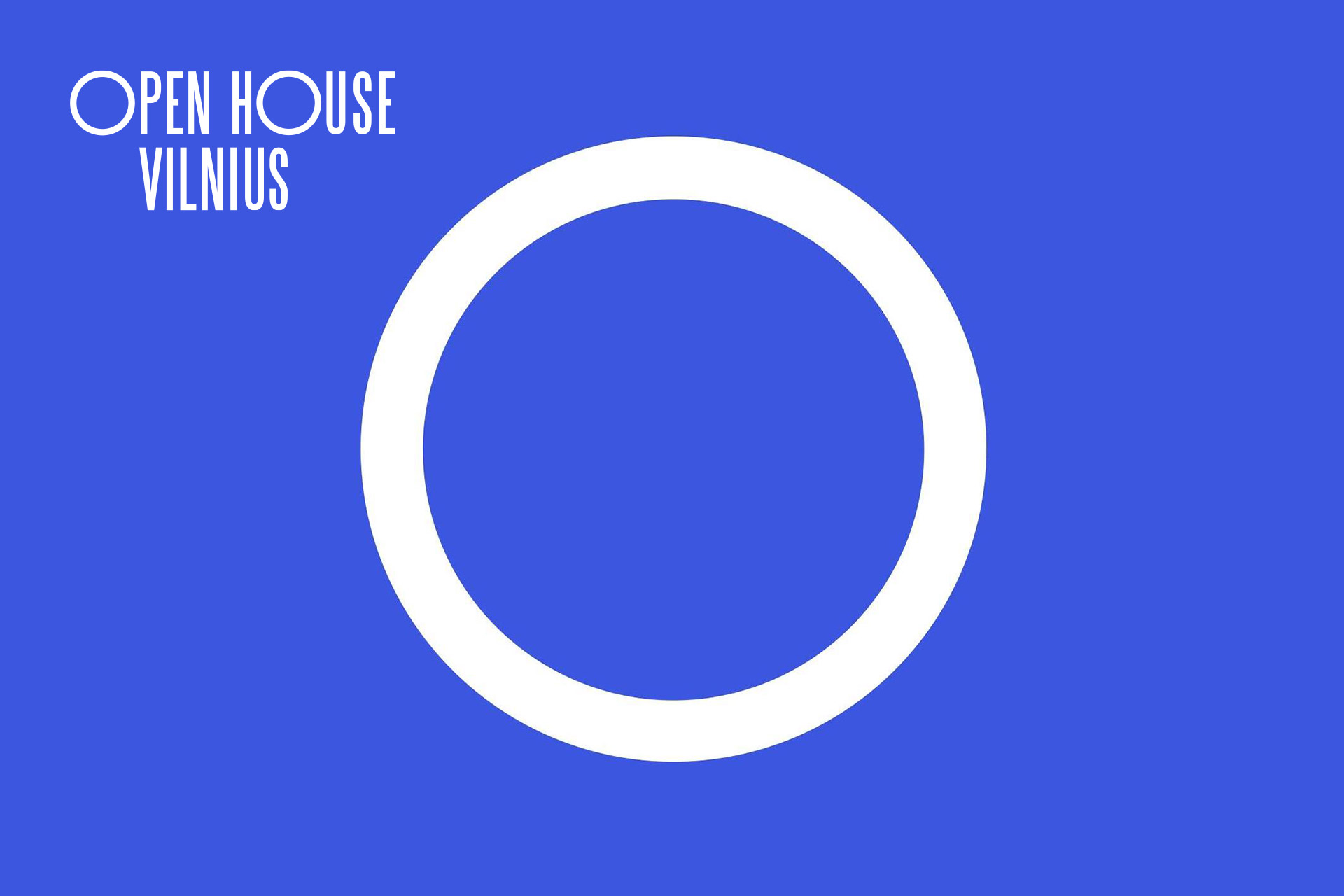
Open House Vilnius is an open architecture weekend: for two days, buildings across Vilnius – usually or partially inaccessible to the public – open their doors and invite citizens and guests in. Organized by the Public Institution “Architektūros fondas”, the event’s whole premise is curiosity about the city’s material environment.
For four consecutive event cycles, I designed and built the campaign’s animated HTML5 banners: 13 banners for Open House Vilnius between 2016 and 2019, plus 2 for the related “Pastatai Kalba” (“Buildings Talk”) project in 2020. Each year brought new formats, new sizes and new technical constraints – and together they form a record of banner craft evolving alongside the web platform itself.
This is small-format work at high intensity: every banner is a complete story compressed into a rectangle between 728×90 and 970×250 pixels, told in seconds, animated at a file weight an ad server will accept, with a single job – make someone curious enough to click and visit a building they have walked past a hundred times.
Role
Graphic & Multimedia Designer (Banner Design, HTML banners, Animation)
Client
Open House Vilnius – a project by the Public Institution “Architektūros fondas” (Architecture Fund).
Scope
15 animated HTML5 banners – 13 for Open House Vilnius (2016–2019) and 2 for “Pastatai Kalba” (2020).
Discipline
Print & Environmental / Digital advertising
The work, year by year
Every campaign year rebuilt the same story with the best instruments available at the time – from a hand-rolled state machine in 2016 to fully composed character animation in 2020. The technical details below are read directly from the banner source files.
2016 – Nine frames and a hand-rolled state machine
The first campaign year: three sizes (250×350, 250×500, 520×230) telling the event story in nine sequential frames – the build that set the template. Each frame is a full-bleed image layer cross-faded through a class-driven state machine timed with nothing but setTimeout calls and CSS transitions (0.66s linear).
Opening frames ease in with a subtle scale settle (1.04 → 1.0 and 0.96 → 1.0 – a gentle “Ken Burns” feel), and the call-to-action frame gets a hand-written bounce keyframe animation, three iterations, to draw the eye to the invitation. Deep indigo (#2d2f77) panels anchor the key frames, and the whole sequence loops forever by re-calling its own init(). Click-through is handled by a clickTag parameter parsed from the URL – the ad-industry convention that lets any ad server inject its own tracking URL.
2017 – Standard formats, single-file delivery
The second year moves to the classic IAB lineup – 300×250, 300×600, 430×300, 728×90, 980×180 – and the build technique tightens: five frames with per-frame in/out classes, on a campaign-blue (#3d81ba) stage, and imagery embedded as base64 directly in the HTML. One file per banner, zero external requests, guaranteed to render anywhere the ad server puts it.
2018 – GSAP enters
By 2018 (300×600, 430×300, 430×400, 570×250), hand-timed classes give way to GSAP TweenLite with the CSSPlugin and EasePack – proper easing curves, sequenced tweens, and a background layer deliberately built wider than its frame (770px of image inside a 570×250 banner), so the scene can drift inside the crop instead of sitting statically.
The ad.size meta tag and a global clickTag variable follow the ad-platform spec book exactly. The banner stops being an animated slideshow and becomes a small motion piece.
2019 – Depth and vertical worlds
The 2019 set (300×250, 300×600, 570×250, 970×250) doubles down on GSAP timelines and on one signature idea: tall, vertical imagery (a 970×1120 background inside a 970×250 billboard) that pans and reveals, with small independent elements layered and animated separately from the main scene. The widest public format – 970×250 – gets a composition that works as a tiny film.
2020 – “Pastatai Kalba”: buildings with eyes
For the “Pastatai Kalba” (“Buildings Talk”) project, the banners take a conceptual leap: the buildings literally get faces. The 300×300 and 980×300 builds are DOM-composed animations – shape layers, line-by-line reveals, an “eyes” layer that gives a building personality, staged text sequences, and a CTA with its own arrow – all orchestrated on GSAP 3.5, bundled through webpack.
No slideshow frames this time: the entire banner is built from positioned elements, so every part – the lines, the eyes, the texts, the button – moves on its own timeline. It is character animation in 60KB.
Scroll down to the banner showcase – every size below opens the original animated build, live, at its true dimensions.
Banner preview
The craft problems nobody sees
Banner design looks like the junior league of design until you actually do it. The constraints are brutal, and they shaped every decision.
- Time. A banner gets roughly 5–15 seconds of attention, often playing muted, autoplaying, and ignored. The narrative has to front-load its hook – which is why the 2016 build opens on its strongest image settle, not on a logo.
- Weight. Ad servers impose file-size ceilings, often stricter than a whole homepage is allowed. Hence base64-embedded single-file builds in 2017, CDN-loaded GSAP micro-plugins in 2018–19, and webpack-bundled assets in 2020 – each year’s delivery format is an answer to the weight budget of that year’s platforms.
- Spec compliance. clickTag variables, ad.size meta tags, strict canvas dimensions, no external fonts at runtime – an ad that violates the ad platform’s spec simply doesn’t run. Four years of banners shipped and served means the invisible spec work held every time.
- Repetition without boredom. The event happens every year with the same core message. The campaign’s visual language had to stay recognizable across 2016–2019 while each year’s build technique visibly advanced – same voice, better instruments.
Design approach
Four principles carried the campaign across four years and fifteen formats – and made a rotating ad slot feel like a place, not an interruption.
- Story first, format second. Every banner, regardless of size, carries the same three-beat story: intrigue → the invitation (buildings open their doors) → the date and the click. The 728×90 leaderboard and the 970×250 billboard tell it with different geometry, but never with different content.
- Motion as meaning. Nothing moves without a reason: scale-settles create calm entrances, the 2018 drifting background gives the scene life without competing with the message, and the 2020 buildings’ eyes are the entire concept – architecture that talks to you, which is the client’s message made literal.
- Color as campaign continuity. The deep indigo and campaign blue panels carried the event’s identity across four years and fifteen formats, so each year’s banners were instantly recognizable as the same event – even in a rotating ad slot.
- Built, not exported. These aren’t video files or animated GIFs – every banner is engineered HTML/CSS/JS. That’s why the animations stay crisp at any rendering, the file sizes stay within budget, and (a quiet bonus) the banners still run today – which is why they can be previewed live, at original size, from this page.
Results
The campaign ran through four consecutive event cycles for Vilnius’ flagship architecture event and its 2020 companion project – a multi-year creative relationship built on work that simply kept running.
- Four consecutive campaign cycles (2016–2019) of animated banners for Open House Vilnius, plus the 2020 “Pastatai Kalba” concept piece.
- A technical evolution that tracked the industry: hand-coded CSS state machines → single-file base64 builds → GSAP timelines → webpack-bundled DOM animation.
- Fifteen banners, all still functional years later and viewable at original size – durability that GIF and Flash-era formats never had.
Lessons & reflections
- Constraints are the whole genre. The 15-second runtime, the weight ceiling, the spec sheet – banners are design under compression, and the compression is where the craft lives.
- The evolution was the practice. Each year’s build was rebuilt with better tools than the last – by 2020, the same designer could compose character animation that 2016’s technique couldn’t have delivered. Doing the same brief four times is the best design education there is.
- Small formats deserve real ideas. “Buildings Talk” with actual eyes is a bigger creative swing than most full campaigns take – in a 300×300 square, it’s almost subversive.
- Code is a design material. Designing and building each banner personally meant no translation loss between the motion imagined and the motion shipped.
Credits & links
- Design & build: Lukas Sabaliauskas – Graphic & Multimedia Designer, Vilnius, Lithuania
- Client: Open House Vilnius / Public Institution “Architektūros fondas”