Web Design
Omerta.lt
A stage built for the MC.
Web & product · Web Design · 2018
5 min read
- Year
- 2018
- Role
- Graphic & Multimedia Designer (Web Design)
- Context
- An official web presence for an established Lithuanian rap artist, built to serve mobile fans and professional audiences alike.
- Outcome
- Delivered as a five-chapter, mobile-first career archive with a chronological timeline and direct routes to music and social platforms.
At a glance
Overview
OMERTA is one of Lithuania’s most established rap artists. This project translated a career built on street credibility, longevity and craft into an official web presence that fans could browse from a phone, while journalists, promoters and festival bookers could take it seriously on desktop.
By 2018, the artist’s story already stretched back more than a decade: a 2005 debut on the “Ultimatumas 3” Lithuanian rap compilation, a rare 100-copy debut EP in 2007, radio hits on ZIP FM and a 2013–2015 run crowned by “Alibi” – the first triple album in Lithuanian music history. Along the way came M.A.M.A. nominations, international support slots and a main-stage opening at the Galapagai festival.
Role
Graphic & Multimedia Designer (Web Design)
Client
OMERTA (Julius) – one of the brightest and most popular Lithuanian rap artists.
Scope
An official, responsive one-page artist website for desktop and mobile: Pradžia (Home), Biografija (Bio), Foto galerija (Gallery) and Kontaktai (Contacts). Designed by Lukas Sabaliauskas and developed by Pashcode.
The challenge
An artist website competes with Spotify, YouTube, Instagram and other platforms that already host music natively. The site therefore had to earn its place by carrying the context, authority and permanence those platforms cannot provide.
Music is an attention-hostile medium on the web
- Carry the full story. A streaming profile shows a catalogue, but not the rare 2007 EP, the ZIP FM chart history or why “Alibi” matters in Lithuanian music.
- Be the official source. An owned domain gives the artist a stable, linkable record of his biography, discography and contact details, independent of changing algorithms.
- Match the persona without cosplay. The name Omerta – the mafia code of silence – called for a serious, loyal and understated tone rather than a noisy fan-page aesthetic.
Practical constraints
- One artist, one page. The content did not need a multi-page system, but it still required a clear architecture to avoid becoming an unstructured long scroll.
- A mobile-first audience. Every interaction had to work for a thumb and a small screen before being expanded for desktop.
- Content that could age well. New releases and appearances needed to fit the structure without requiring a redesign.
Project goals
- Create a single, official and permanent home for a career spanning more than ten years.
- Turn legacy details into a structured narrative rather than a collection of trivia.
- Bridge visitors to Facebook, Instagram, Spotify and YouTube instead of trying to replace those platforms.
- Prioritise the mobile experience used to discover, skim and share the artist’s work.
- Express street credibility through typography, imagery and restraint rather than decoration.
Information architecture
The page was organised into four stations that mirror how a curious visitor investigates an artist: arrive, learn the story, see the proof and make contact.
1. Pradžia (Home)
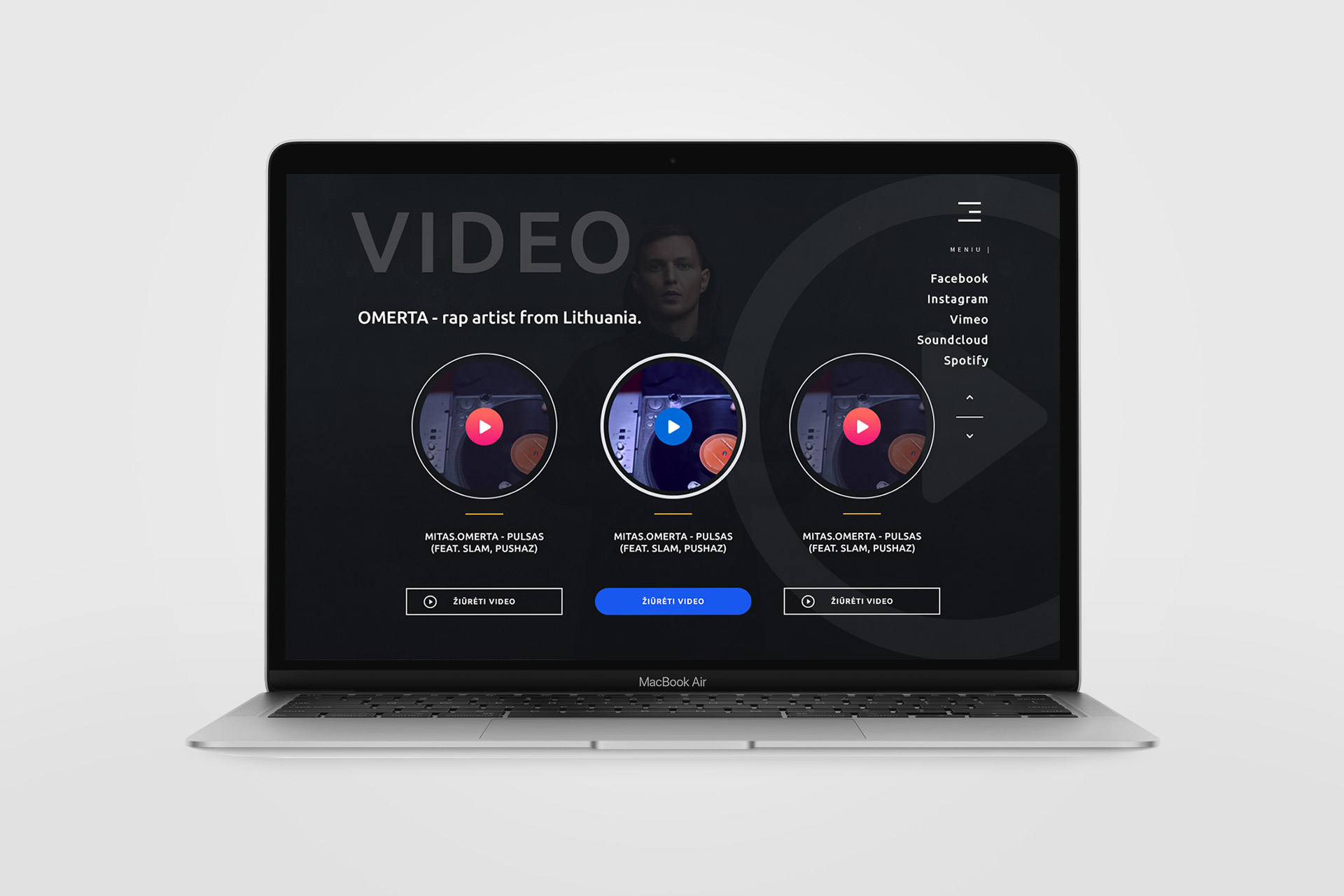
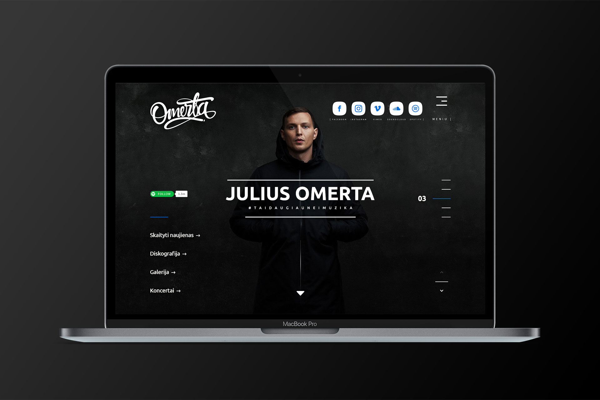
A confident introduction identifies OMERTA immediately and provides direct routes to his social and streaming channels. Within one screen, visitors know whose site they are on and where else they can find him.
2. Biografija (Bio)
The centrepiece is a five-part narrative with a deliberate “1 / 5 – next part” progression: the 2005–2007 origins, the 2008 breakthrough, the 2012 return, the 2013–2014 “Alibi” era and the 2015 triple album. A complete 2005–2015 discography follows as a chronological career map.
3. Foto galerija (Gallery)
Performance and portrait photography provides visual evidence of the artist’s history, grounding the biography in real stages and real audiences.
4. Kontaktai (Contacts)
Phone and email lead into the artist’s sign-off hashtag, #TAIDAUGIAUNEIMUZIKA (“it’s more than music”), which works as both a slogan and a memorable brand closer.
Design solution
The final experience uses one-page discipline, chaptered storytelling and restrained visual direction to present a long career without making the visitor work through a conventional press kit.
Web experience
- Four clearly signposted sections form one continuous story instead of a sprawling multi-page website.
- The biography is divided into five numbered chapters with previous and next controls, making long-form content easier to navigate, revisit and cite.
- Each discography entry is anchored to a year and context, turning catalogue data into a visual argument for longevity.
- Persistent Facebook, Instagram, Spotify and YouTube links make the owned site a hub, with listening and following always one tap away.
- The chaptered biography, gallery and contact links remain comfortable to use on both mobile and desktop screens.
Visual direction
- Restraint becomes attitude: no autoplay, crowded widgets or decoration for its own sake.
- Typography carries the hierarchy through bold statements, structured timelines and clear section identities.
- Photography acts as proof, connecting the career narrative to performances, stages and audiences.
- The closing hashtag is treated as a genuine brand asset rather than incidental contact-page copy.
Website showcase
Results
The project delivered a credible official home for an artist whose career predates and outlasts any single social platform. Five chapters and a chronological timeline make more than a decade of releases legible in minutes, while the hub-and-spoke structure keeps streaming and social destinations one tap away.
Its structure and content architecture have visibly held up years after launch, with the original design and development credits still intact.
Lessons & reflections
- An artist’s website should be the story, not the shop. Streaming platforms distribute the music; the site’s irreplaceable role is legacy and context.
- One-page websites are information-design problems. The central challenge was sequencing a decade-long career into navigable chapters and a useful chronology.
- Designing for the thumb was the correct primary decision for a mobile Lithuanian rap audience, not a desktop compromise.
- For an artist named after a code of silence, restraint was the strongest branding move: the design says less and means more.
Credits & links
- Design: Lukas Sabaliauskas – Graphic & Multimedia Designer, Vilnius, Lithuania
- Development: Pashcode