Web Design / Branding
Pamario-nt.lt
The coast, in one portal.
Web & product · Web Portal · 2020
6 min read
- Year
- 2020
- Role
- Graphic & Multimedia Designer (Web Design / Branding)
- Context
- A unified brand and property portal for a Klaipėda real estate agency serving Lithuania’s coastal market.
- Outcome
- Delivered as one working identity and search-led property platform that remains live and actively updated six years later.
At a glance
Overview
Pamario NT is a real estate agency based in Klaipėda, working the Lithuanian coast – the region where the Curonian Lagoon meets the Baltic, and where Klaipėda, Neringa and Palanga make up the country's most emotionally charged property market. Their own pitch says it best: buying property on the coast is an investment in your and your children's future – a financial guarantee that will never lose its value.
The 2020 engagement covered the full stack: logo, identity, stationery, print works and a responsive web portal. And the website is the interesting part – because this isn't a brochure site for an agency, it's a working listings portal with thousands of live objects (at the time of this writing: ~2,500 apartments, ~1,460 houses, ~259 plots, ~148 commercial spaces and garden properties), regional taxonomies, deep search filters and three languages.
That distinction – agency brand up front, platform underneath – is what this case study is about.
Role
Graphic & Multimedia Designer (Web Design / Branding)
Client
UAB "Pamario NT" – real estate agency, Taikos pr. 52C, Klaipėda, Lithuania
Scope
Logo design, brand identity, graphic design, stationery design, print design works, and a responsive real estate portal (desktop & mobile)
The brand: the name is the territory
"Pamario" means "by the lagoon" – the Kuršių marios, the Curonian Lagoon that defines the region. The name doesn't describe a company; it describes a place. And in coastal real estate, the place is the product: buyers aren't shopping for square meters, they're buying proximity to the sea, the lagoon, Neringa, Palanga – what the agency's own copy calls "the gateway to Europe, the gateway to the world… a city where it's good to live."
The identity's strategic job was therefore unusual for a realtor: not to sell a service, but to sell the territory – and to make Pamario NT read as the territory's natural, local expert. The brand positioning writes itself from the name: the agency that lives where it sells. Trust in real estate is local trust – an agency named after the lagoon it sits beside starts every conversation with a home-field advantage.
The second trust layer: legal authority. The agency's identity isn't only "we know the neighborhood" but "we know the law" – its brokers are also legal specialists, offering legal consultation on every transaction. The brand therefore had to carry both warmth (the coast) and rigor (the contract) – a duality that shaped the visual register and the site's tone of voice alike.
The real problem: a portal, not a brochure
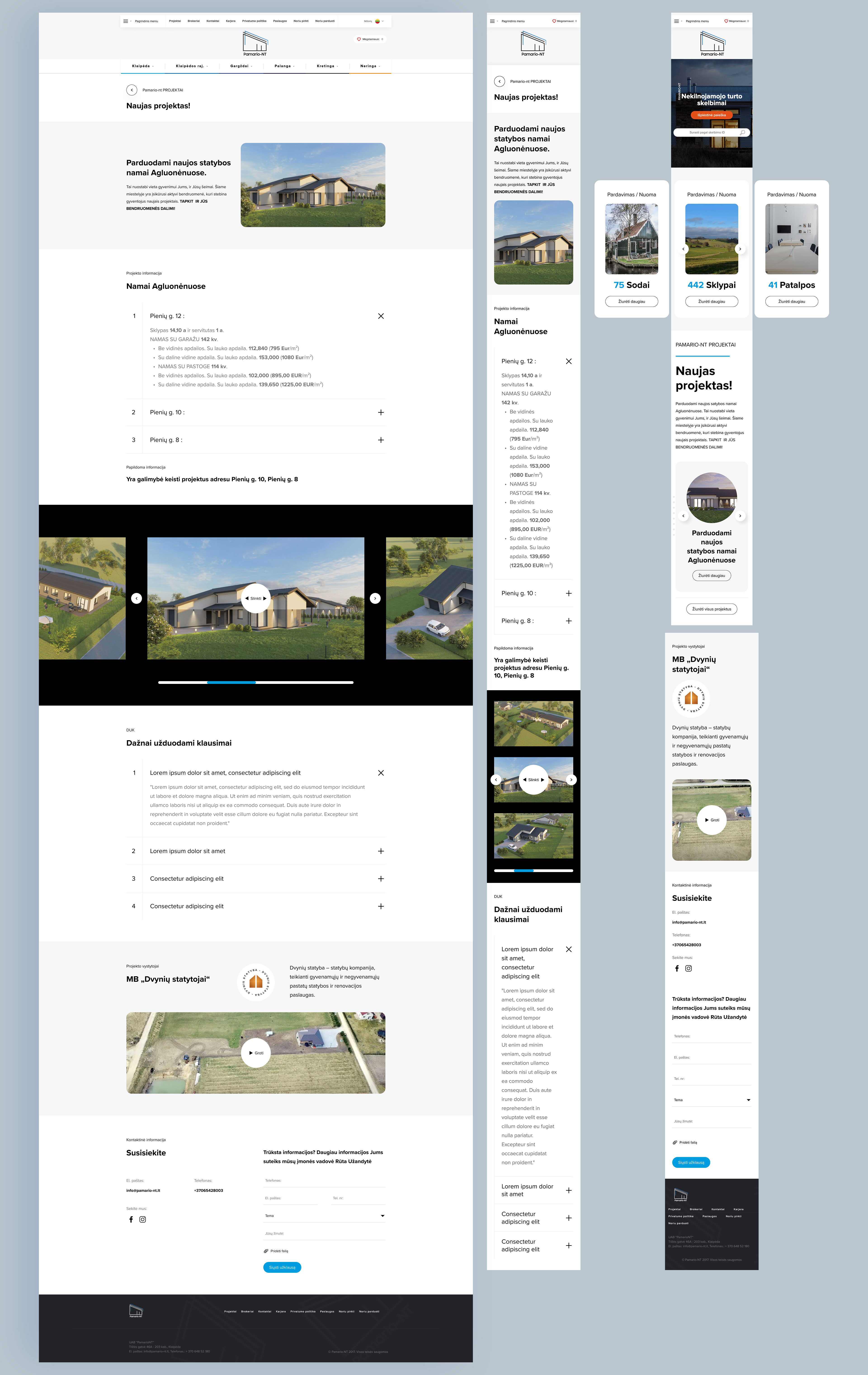
Most agency sites are brochures – a few profile photos and a contact form. Pamario-nt.lt is a functioning property platform, and the design work had to respect platform logic.
The taxonomy is the architecture
The information architecture is a three-dimensional grid, and every listing lives at an intersection:
- Region axis: Klaipėda city → Klaipėda district → Gargždai → Palanga → Kretinga → Neringa – plus Cyprus ("NT objektai Kipre"), an international listings arm aimed at Lithuanian buyers abroad.
- Property-type axis: apartments (including new-builds, rooms), houses, cottages/townhouses, commercial premises, land plots, homesteads (sodybos), garden plots (sodai), rentals.
- Intent axis: "Noriu pirkti" (I want to buy) / "Noriu parduoti" (I want to sell) – the two audiences of any agency, given equal-weight routes from the main navigation rather than burying sellers in a footer.
URLs mirror the taxonomy (/lt/klaipeda/butai, /lt/gargzdai/sklypai…), so every category intersection is its own indexable, shareable page – the kind of architecture that quietly wins search traffic for a regional agency.
Search deep enough for professionals
The extended search reads like it was designed with a broker's checklist: price, area, plot size, floor and floor count, building material (wood, brick, frame, monolith, log…), heating type (geothermal, pellet, gas…) and condition (renovated, luxury-finished, needs repair…). Below that, a street-level layer: dozens of Klaipėda micro-districts as filter options – Kiškėnai, Dangė, Smeltė… – because locals search by neighborhood, not by district code. A "favorites" counter (Mėgstamiausi: 0) personalizes repeat visits.
Trilingual, for a market that needs it
Lithuanian, Russian, English – each a real audience on the coast: local buyers, the region's Russian-speaking residents, and foreign investors eyeing Neringa and Palanga. Multilingual support isn't decoration here; it's market access.
The design solution
Identity & print
- Two trust registers, one identity. Warmth for the coast, rigor for the law: the identity needed a palette and typography that can carry a sunset-over-the-lagoon listing photo and a legal consultation flyer without changing character.
- Stationery as institutional proof. In a legally heavy trade, the letterhead, business card and document templates are working trust artifacts – the brand appears on contracts, so the paper system has to look like it understands the stakes.
- Print works for a paper-driven trade. Property presentations, listing sheets and office materials – print remains a real medium in real estate, where documents change hands at every stage.
Web experience
- Responsive portal design – desktop for the deep search session, mobile for the Sunday drive past a plot for sale; both demand the taxonomy stay navigable at thumb scale.
- A front page that works like a homepage and a search hub – hero categories with live counts (Butai 2,535 · Namai 1,460 · Sklypai 259…), newest listings carousel, and the agency story – brand and platform on one screen.
- The agency made visible. About, team, services, career pages – for a trust business, showing the humans behind the listings is part of the conversion path, not an afterthought.
- Location poetry with a business spine. The About section sells Klaipėda like a tourism board – sea, lagoon, Neringa, "a city where it's good to live" – then lands on the legal-expertise pitch. The emotional close and the rational close, sequenced.
Branding, print & web showcase
Results
A coastal agency's brand and a working property portal, delivered as one system – and still running a live, actively updated business six years on.
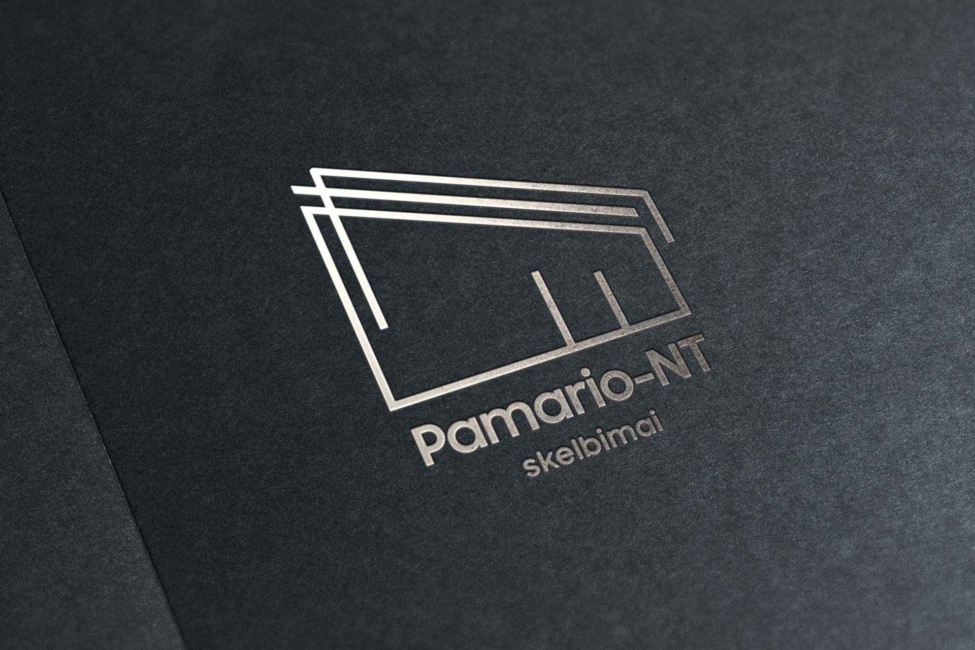
- A brand built on the agency's strongest asset – the territory in its name – carried coherently across logo, print, stationery and web.
- A functioning property portal: multi-region taxonomy including Cyprus, professional-grade search filters, favorites, three languages – agency-scale tooling for a regional firm.
- The dual-intent architecture (buy/sell) giving both revenue paths equal infrastructure.
- Six years of continuous operation – the 2020 design still running a live, actively updated business.
Lessons & reflections
- When the name is a place, sell the place. "Pamario" made the coastal territory the brand's core asset; every artifact – logo to About copy – reinforced the same claim: local experts, by the lagoon.
- Agencies need platforms, not brochures. The taxonomy-first architecture (region × type × intent) turned the site into working infrastructure – the kind of decision that compounds for years, as the live portal proves.
- Search design is respect for the user. Heating type and building material filters aren't tech flexes – they're how serious coastal buyers actually evaluate. Designing the search deep enough for professionals is designing for conversion.
- Trust has two faces in real estate: warmth and law. The coast brings buyers in; legal expertise closes them. The identity had to speak both dialects – and that duality is the quiet craft of this project.
Credits & links
- Branding, logo, print & web design: Lukas Sabaliauskas – Graphic & Multimedia Designer, Vilnius, Lithuania
- Client: UAB "Pamario NT", Klaipėda
- Live portal: pamario-nt.lt