Web Design / App Design / Print & Illustration
Minimalist F1 Circuit Collection
49 posters, one system.
Print · Print & Illustration · 2025
7 min read
- Year
- 2025
- Role
- Solo – Product / UX / UI / Frontend (Web + PWA, offline-ready)
- Context
- A self-initiated Formula 1 poster gallery that turns 49 hand-traced circuits into a themeable, offline-capable web application.
- Outcome
- Shipped as a complete PWA with 43+ themes, six formats, live season data, two exploration modes and a full export pipeline.
At a glance
Overview
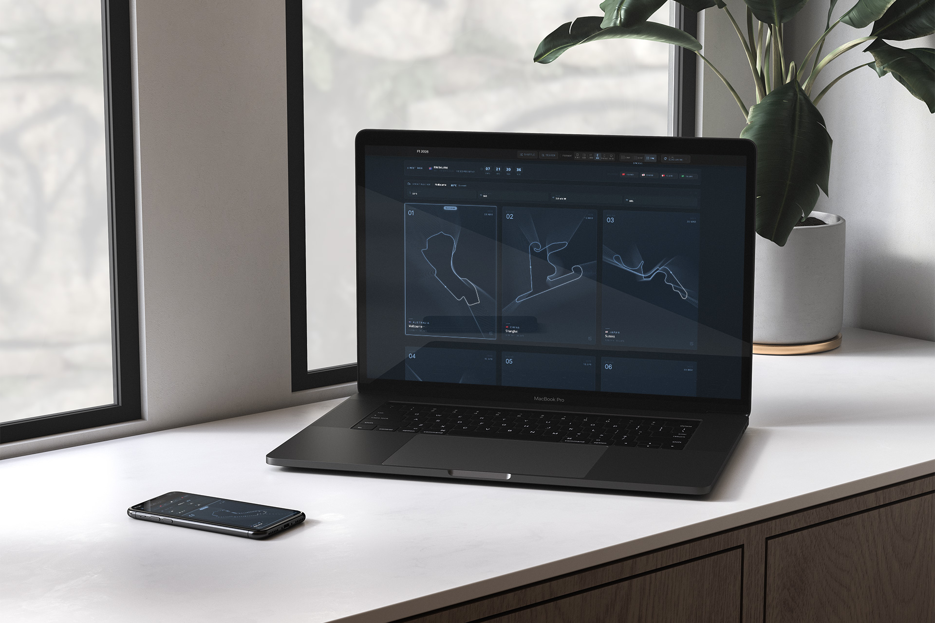
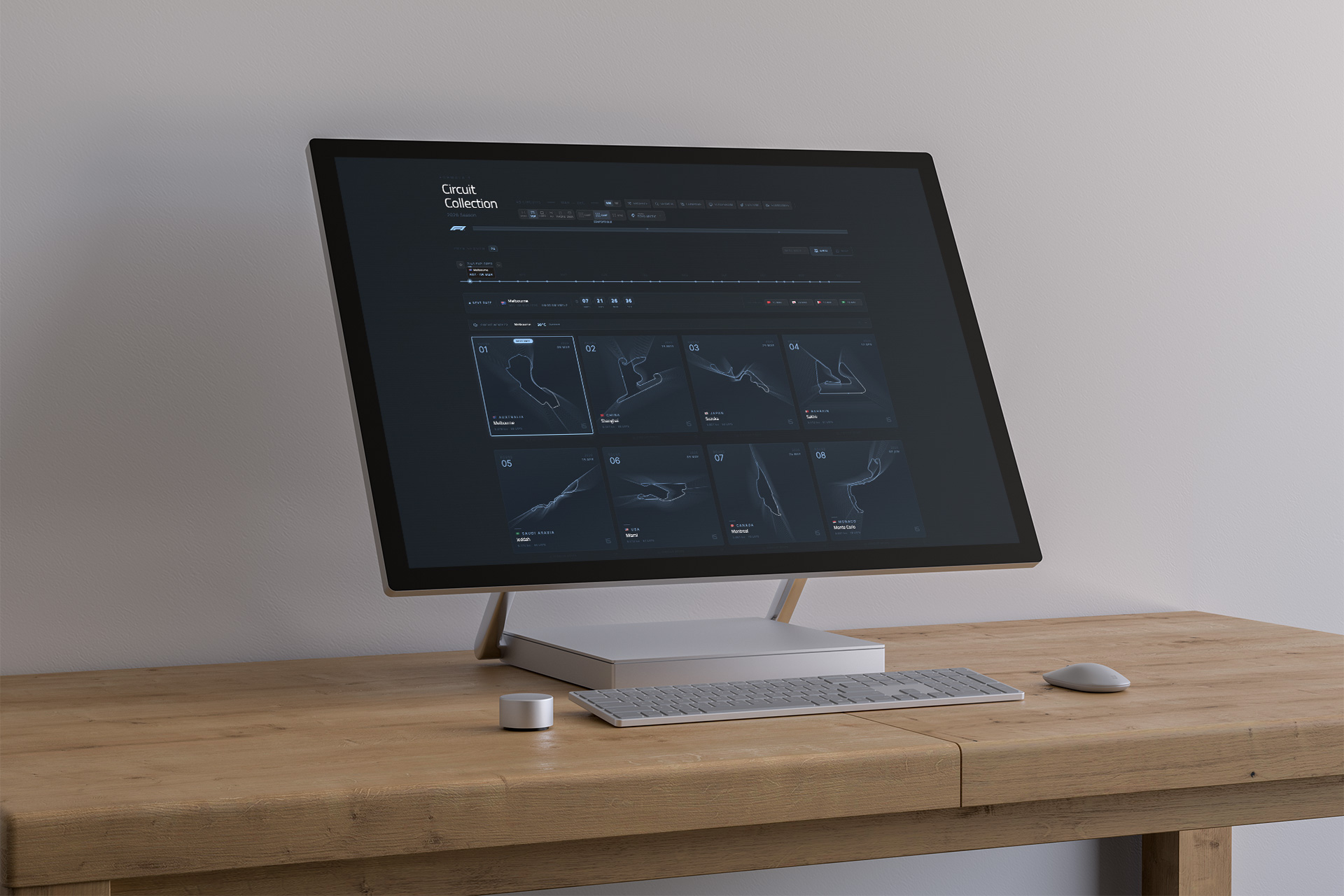
Circuit Collection is a minimalist Formula 1 poster gallery – a web application where every circuit of the 2026 season, plus a set of classics, is a hand-traced SVG track layout rendered on a dark, theme-able poster card, each carrying its own signature accent color. It is a self-initiated, end-to-end product: one designer doing product thinking, UX, UI, frontend engineering, data integration and export tooling – and shipping it as an offline-capable PWA.
The one-line architecture: 49 manually traced SVG circuits plus metadata, rendered into a consistent poster template system with 43+ themes, multiple formats, live season data and a full export pipeline. Behind that line sits a serious single-page application – and this study takes it apart.
Role
Solo – Product / UX / UI / Frontend (Web + PWA, offline-ready)
Platform
Single-page React application (no routing needed) with a service-worker PWA layer
Scope
Product thinking, poster system, UI design, data integration, export tooling, performance, accessibility, PWA
The problem, self-assigned
Most circuit diagrams online are static images in a dozen inconsistent styles. The project's own brief: create a space where the circuits feel like a cohesive collection – posters that look good, but are also useful for real use: showing what's coming up, where things are, and what's happening right now.
The goals, set at kickoff
- Make circuit layouts feel premium and consistent across the whole season
- Enable fast exploration: search, filter, favorites, quick navigation
- Provide meaningful season context: next race, timeline, standings, weather
- Support sharing and making: SVG/PNG export and batch download – the gallery as a source, not just a destination
- Keep UX smooth at scale: a large grid that never stutters, responsive at every size
Three user archetypes
- Fans – browsing circuits like a gallery
- Creators – exporting posters for wallpapers and prints
- Explorers – wanting map-based discovery and a clear answer to "what's next"
The collection beneath the collection
Everything rests on an authored dataset – the part most gallery projects skip. The dataset is a curatorial statement, not a scrape.
- 49 circuits: 24 from the 2026 season plus 25 classic/historic tracks
- Each circuit carries a manually traced SVG path with its own viewBox and accent color – the linework is authored, not downloaded
- Optional start-position metadata, plus stats and location fields: laps, length, lap record, first GP, turns, direction, country, city
The design consequence of a traced dataset is the whole product's premise: because every path is drawn by the same hand to the same rules, the system can guarantee consistency – layered strokes, draw-on animation, hover glow – for all 49 posters automatically. Consistency is manufactured at the data layer, not hand-tuned per card.
The poster engine
The visual core is a layered SVG rendering pipeline with real craft in it.
- Layered strokes – glow, core, highlight – creating depth that survives at any scale, plus optional echo/ripple layers for signature effects
- "Draw-on" animation (CSS @keyframes stroke techniques) – the track draws itself, like a broadcast graphic
- Start/finish marker with pulse effects; hover scale and glow interactions – every poster alive, but restrained
Theming as user creativity
- 43+ themes, including team-inspired palettes, controlling background gradient, optional patterns (dots / grid / cross / scanlines / tiles / none), text and accent colors (per-track or fixed), stroke styles and an optional "flag fill" mode
- Theme Builder – users compose custom themes, persisted locally: theming as user creativity, not just designer styling
- Formats: portrait / square / landscape / A3 / phone / desktop, plus grid density modes – the same poster system answering print, wallpaper and web contexts
Typography carries its own logic: Titillium Web – the typeface family long associated with F1 graphics – for headings, labels and captions; Inter for body text. The aesthetic borrows from F1 broadcast design and stays deliberately dark and restrained: less chrome, more collector poster.
Poster showcase
Scroll through the collection below – a selection of circuit posters across themes and formats. Click any thumbnail to open the gallery view.
Interactive experience
Explore the circuit collection
Open the interactive minimalist F1 circuit experience.
Launch experienceCore UX flows
The interaction design serves the three mindsets without compromise.
- Grid mode – poster browsing: fast scanning, collecting, favoriting. Search across track name, country, city and IDs (Ctrl/Cmd+K to focus), country "flag chips" for instant filtering, persistent favorites
- Detail modal, not a page jump – a fullscreen poster view with navigation via buttons, keyboard or swipe; export, share and compare entry points; even add-to-calendar (ICS) – a poster that puts the race on your calendar
- 3D flip – each card has a stats "trading card" back (mobile: long-press) – a physical collector metaphor, digitized
- Compare mode – two circuits side-by-side with a stats table and swap actions
- Slideshow – fullscreen auto-advance with timing controls and keyboard shortcuts: the gallery becomes a wall
- Map view – an interactive SVG orthographic globe (no WebGL), dots plotted by lat/lng on Natural Earth land boundaries – answering "where are the races?" in a spatial register
The "next race" is threaded through everything as a first-class UI concept: detection highlights the card, countdown and timeline emphasis, weather, quick-jump affordances – the app always knows what matters now.
Live season data, with courtesy
Two live external data sources, integrated with restraint.
- Standings via the Jolpica API (the community successor to Ergast) – with cache indicators and fallback handling: if the API fails, the app degrades politely, never breaks
- Weather via Open-Meteo (no API key required) – with caching and manual refresh controls
The pattern is worth naming: live data is a guest in the gallery – cached, indicated, and never allowed to hold the core experience hostage. The posters work forever; the season data makes them timely.
Export: the gallery as a source
The most distinctive product decision: this gallery's output is meant to leave.
- PNG export at 2× scale via html-to-image (DOM-to-image)
- SVG export in "full" or "minimal" variants, plus copy-to-clipboard
- Batch export – a Zip of visible posters (2× PNG) via JSZip with a progress UI and cancel control; FileSaver.js triggers downloads
- URL state sharing – track, theme, format, search, filter and favorites all sync into query params: every view state is a deep link, without client-side routing
That last point is architectural: deep linking via URL params means a user can send someone a specific poster in a specific theme as a link – a shareable artifact instead of an app state.
Engineering detailsTechnical deep-dive
Under the hood
State, performance, accessibility and the PWA layer were engineered as deliberately as the visuals.
State and persistence
- Centralized state via a useGalleryState custom hook – no external store. The state problem was analyzed and found solvable with React's own primitives; the discipline is in not importing a state library the app didn't need
- Persistence via localStorage: preferences, favorites and viewed circuits, weather cache, custom themes
Performance at collection scale
- IntersectionObserver lazy rendering (LazyCard) so only visible cards render
- Memoization, a 150ms debounced search, and batched animations
Accessibility, including paper
- Skip link, semantic structure, keyboard navigation with focus management
- A print stylesheet – the poster system respects paper natively
PWA
- Service worker with app-shell plus API/image caching tiers – fast repeat loads, full offline resilience, and update banners when a new version ships
Tech stack
- React 18+ (functional components, hooks), TypeScript (strict), Tailwind CSS v4, Vite
- Motion (via motion/react), Radix UI, Lucide React, Sonner
- html-to-image, JSZip, FileSaver.js for the export pipeline
- Jolpica F1 API, Open-Meteo, Natural Earth (TopoJSON) for data
- Titillium Web and Inter for typography
Delight, contained
Easter eggs – Konami triggers, special visual modes, mobile shake-to-shuffle – exist as a layer, never blocking the core UX. The polish is real but subordinated; the collection is the product.
Results
What shipped: a complete, offline-capable product – 49 authored circuit posters in 43+ themes and 6 formats, live season context (next race, countdown, weather, standings), a full export pipeline (PNG, SVG, Zip, clipboard, deep links), dual exploration modes (grid and globe), compare, slideshow and trading-card flip – all at collection scale with no external state library and no routing framework.
As a self-initiated project there is no client scorecard; the shipped outcome is the result. The app is live, offline-capable and architected for continued feature growth.
Lessons & reflections
- The data model is the design system. Because every circuit path was traced by hand to shared rules, consistency across 49 posters is guaranteed by the dataset, not re-earned in each card. That inversion – consistency manufactured at the data layer – is the project's deepest idea, and it transfers to any design system work
- Two mindsets, two native modes. Grid and globe serve visual collecting and spatial exploration as separate equals instead of a compromise – the same courage as giving buy and sell their own paths
- Live data as a polite guest. Cached, indicated, fallback-handled external APIs: the gallery is timeless, the season data is timely, and failure of one never breaks the other
- Let the output leave. Export is not a feature bolted on; it's the point – posters for walls, wallpapers, print. A gallery whose artifacts live in the world outlives any session
- Restraint in dependencies is a design decision. useGalleryState instead of a state library; URL params instead of a router; an SVG orthographic globe instead of WebGL. Every library not imported is a maintenance budget saved – and an architectural judgment proven
- Self-initiated work is the honest portfolio. No brief, no compromise – every choice here is judgment made visible, which is exactly what it demonstrates
Credits & links
- Product, UX/UI and frontend: Lukas Sabaliauskas – Graphic & Multimedia Designer, Vilnius, Lithuania